Home » How to Design Effective Exhibition Graphics
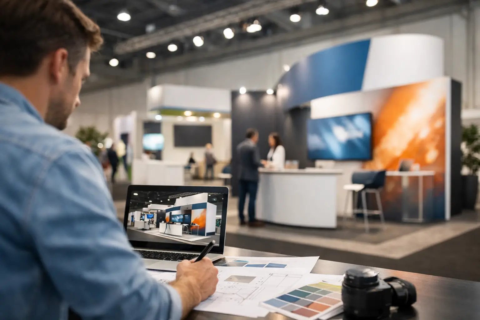
How to Design Effective Exhibition Graphics
A busy exhibition hall gives you only a few seconds to earn attention. Visitors are walking, talking, checking schedules and comparing dozens of competing stands. To design effective exhibition graphics, every visual decision must make the next action easier: notice the brand, understand the offer, and start a conversation.
For property developers, architects, house builders and brand teams, this is not simply a question of making a stand look polished. Exhibition graphics must communicate a commercial proposition at scale, often before a member of staff has spoken to the visitor. The strongest work blends creativity with precision, using brand, layout, imagery and messaging to create a clear reason to stop.
Start with the job the stand needs to do
Exhibition graphics work best when they are designed around a defined outcome rather than a vague aim to ‘raise awareness’. A development launch may need to generate sales appointments. An architectural practice may want to demonstrate sector expertise. A consumer brand may be introducing a product range and require retailers to understand its point of difference immediately.
That objective affects every part of the creative approach. If lead generation is the priority, graphics should make the offer and next step unmistakable. If credibility is the aim, project imagery, testimonials, accreditations and carefully selected statistics may carry more weight. Trying to communicate every service, audience and achievement at once usually produces a stand that is visually busy but commercially quiet.
Before design begins, agree the audience, the primary message and the action you want visitors to take. These three decisions provide a practical filter for every headline, image and panel. If an element does not support them, it is probably taking up valuable space.
Design effective exhibition graphics for distance first
A stand is not read like a brochure. It is seen from across an aisle, then understood from a few metres away, then explored at close range. Good exhibition design recognises these different viewing distances and assigns information accordingly.
At long distance, visitors need a recognisable brand, a concise proposition and a strong visual cue. This could be a striking CGI of an upcoming scheme, a hero product image or a clear, confident headline. It should be possible to understand the broad subject of the stand without stepping inside it.
From mid-distance, the graphics should explain why the offer matters. A house builder might show the lifestyle, location and quality of a new development through exterior CGI, site plans and a short supporting statement. A business-to-business brand may use a simple benefits-led message, supported by product imagery or a carefully chosen case study.
At close range, visitors can engage with detail: specifications, credentials, QR codes, floor plans, brochure covers or supporting project information. The trade-off is simple. Detail can help a serious prospect make a decision, but too much of it weakens the impact of the stand from the aisle. Reserve the largest type and clearest space for the message that must be seen first.
Make hierarchy visible, not implied
A visitor should not have to work out where to look. Use scale, contrast, position and whitespace to lead the eye through the stand. In most cases, a clear hierarchy includes the brand, a primary message, a key image and one relevant call to action.
Headlines need to be short enough to absorb while walking. A line such as ‘New homes, better connected’ can work harder than a paragraph explaining location, specification and tenure. The supporting information can then do its job once attention has been won.
Avoid treating every panel as equally important. When every headline is large, every colour is bright and every surface is filled, nothing feels like the focal point. Strong graphic design creates moments of emphasis and areas of calm.
Use imagery that proves the promise
For visually led sectors, imagery often carries the first and most persuasive part of the story. It must be high quality, relevant and considered in the context of the stand’s physical scale. A low-resolution image may look acceptable on screen but become soft, pixelated or unconvincing when printed across a large wall.
CGI is particularly valuable where a place, product or environment cannot yet be photographed. Photorealistic exterior and interior visuals can help visitors understand an unbuilt development, see the finish of a future space or picture themselves within it. The image should do more than decorate the wall. It should support the positioning of the scheme, whether that is premium city living, family-focused housing, sustainable design or commercial opportunity.
Choose fewer, stronger images rather than creating a crowded gallery. A single well-art-directed visual can establish quality and atmosphere more effectively than six competing scenes. Where several visuals are necessary, use a consistent lighting style, viewpoint and colour treatment so the stand feels like one campaign rather than a collection of separate assets.
Treat brand consistency as a commercial advantage
Exhibitions are often one part of a wider marketing programme. Visitors may encounter a social advert before the event, receive a printed brochure at the stand and later view a presentation or website. Consistent branding makes these touchpoints easier to recognise and more credible.
This does not mean applying a logo to every available surface. It means using a coherent set of visual decisions: typography, colour palette, image direction, tone of voice and graphic devices. The identity should be distinctive enough to stand apart in a crowded hall while remaining familiar to existing customers and stakeholders.
For a property launch, for example, the same visual language can connect hoarding, sales collateral, CGI, exhibition panels and digital marketing. Coordinating these assets through one creative team reduces the risk of mismatched imagery, inconsistent messaging or last-minute compromises in production.
Plan for the physical environment
Exhibition graphics are not flat files. They are printed, installed, lit, viewed around furniture and sometimes partially obscured by people. A beautiful layout can fail if it ignores the practical conditions of the stand.
Check where walls, counters, screens, storage doors and product displays will sit before finalising artwork. Important wording should not disappear behind a coffee machine, a display unit or a member of the team standing at the front of the stand. Likewise, consider sightlines from the main visitor approach rather than designing every elevation in isolation.
Lighting changes colour and perceived quality. Dark finishes may feel sophisticated but can lose detail under poor lighting. Pale graphics can look clean and premium, though they may need stronger contrast to remain legible from a distance. Material choice also matters. Fabric walls, vinyl, rigid panels and backlit displays each affect colour, texture and visual impact differently.
Print production deserves the same attention as the concept. Supply artwork at the correct scale and resolution, allow for bleed and trim, check colour profiles, and request proofs where colour accuracy is critical. If a stand includes large-format CGI, technical checks should happen early enough to avoid reworking imagery when deadlines are tight.
Give visitors a clear next step
A striking stand is useful, but a striking stand that creates a measurable action is more valuable. Decide whether the next step is a conversation, a demonstration, a brochure collection, a meeting booking or a digital enquiry. Then make that route visible and straightforward.
QR codes can be effective when they lead to something genuinely useful, such as a development brochure, interactive tour, specification pack or appointment form. They are less effective when placed without context or used as a substitute for a clear message. Pair them with a benefit: ‘View the full masterplan’ is more persuasive than ‘Scan here’.
The stand team and the graphics should support each other. If the wall promises an exclusive preview, staff need a natural way to continue that conversation. If the main visual promotes a new product, samples or demonstrations should be easy to find. Consistency between the physical environment and the sales conversation builds confidence.
Build in time for refinement
The best exhibition graphics are rarely produced by sending a logo and a few images to print. They benefit from a structured process: clarify the brief, map the stand, develop the core message, test visual hierarchy, prepare production artwork and check final specifications with the stand contractor.
There will always be trade-offs between ambition, budget and time. A fully backlit structure may create exceptional impact, but a carefully designed panel system with strong CGI and disciplined messaging can still perform extremely well. The right answer depends on audience, venue, stand position and the commercial value of each potential lead.
Give the creative process enough room for one important test: stand back from the artwork and ask what a passing visitor will understand in three seconds. If the answer is clear, relevant and compelling, the graphics are ready to earn their place on the exhibition floor.
