Home » Planning Application Visual Guide for Better Submissions
Planning Application Visual Guide for Better Submissions
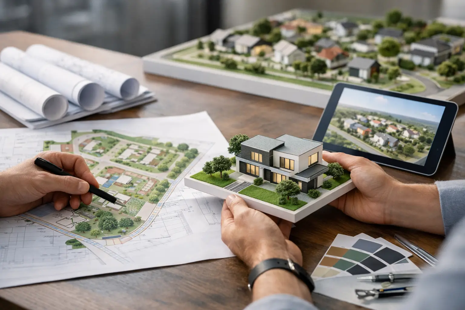
A proposed building can be technically sound, policy-compliant and carefully designed, yet still face unnecessary resistance if people cannot understand what they are being asked to approve. A strong planning application visual guide gives officers, consultees and local residents a clear, credible picture of the proposal in context. It is not about making a scheme look better than it is. It is about communicating scale, materiality, setting and impact with enough precision to support an informed decision.
For developers, architects and house builders, that distinction matters. Planning visuals sit between design intent and public perception. When they are prepared early, verified properly and presented as a coordinated set, they can reduce ambiguity at a point where ambiguity is costly.
What planning visuals need to achieve
A planning submission is assessed against drawings, policy, technical reports and consultation feedback. Visual material does not replace any of these documents, but it can make their meaning much easier to grasp. A decision-maker should be able to see where a proposal sits, how it changes a street scene or landscape, and what its key design moves mean at human scale.
The most effective visual packages answer practical questions. How tall will the building feel from the pavement? Will a new block sit comfortably alongside neighbouring properties? What will mature landscaping screen, frame or reveal? Where do access, parking and public routes sit in relation to the development?
Accuracy is the foundation. An attractive image that conflicts with submitted drawings, omits nearby structures or uses an implausible viewpoint can damage confidence in the wider application. By contrast, a carefully modelled image supported by survey information and agreed viewpoints demonstrates control, diligence and respect for the planning process.
Planning application visual guide: choose the right outputs
There is no universal set of visuals for every scheme. A minor infill proposal may need a clear streetscene elevation and a handful of verified views. A major residential, mixed-use or commercial development may need a more detailed package that explains phasing, public realm, massing and views from sensitive locations.
The right approach depends on the scale of change, the sensitivity of the site and the issues likely to arise in consultation. Starting with those issues is more effective than commissioning images simply because they look polished.
Existing and proposed site plans
Site plans establish the facts: site boundary, building footprint, access points, parking, refuse stores, amenity space, retained trees and surrounding roads. They are often the quickest way for an officer or consultee to orientate themselves, particularly on constrained sites.
A well-designed plan should be clean enough to read at the submitted scale. Consistent labels, an appropriate level of detail and a restrained colour palette help the proposal stand apart from the existing condition without turning the drawing into marketing artwork. For larger developments, a clear parameter plan or illustrative masterplan can show how the individual parts work together.
Streetscenes and contextual elevations
Elevations become more persuasive when neighbouring buildings are shown. A contextual streetscene helps explain ridge heights, façade rhythm, plot width, window alignment and the relationship between old and new.
This output is particularly valuable where objections may focus on overdevelopment or perceived height. It should not flatten a complex discussion into a single image, however. If levels change across the site, or the proposal is viewed from several directions, more than one elevation or section may be needed to give a fair account.
Verified photomontages
Photomontages place an accurately modelled proposal into a photograph of the real location. They are useful where visual impact is central to the decision, such as conservation areas, prominent gateways, green-belt edges, town-centre sites or schemes close to heritage assets.
The credibility of a photomontage rests on its method. Camera location, lens, date of photography, survey data and wireline alignment all influence whether the view is dependable. The final image should make the proposed form understandable, but the supporting material should also allow the assessment to be checked. A simple existing view, wireline and rendered version can be far more useful than a glossy image on its own.
CGI views that explain lived experience
Architectural CGI has a different role. It can communicate material character, entrances, landscaping, activity and the quality of spaces that drawings cannot fully convey. For a residential scheme, an eye-level view might show the arrival sequence and public realm. For a commercial proposal, it may clarify frontage, servicing separation or the relationship between workspace and street.
CGI needs judgement in a planning context. Excessively dramatic lighting, crowded scenes or unrealistic planting can distract from the architecture and invite scepticism. The strongest planning images are calm, plausible and specific to the proposal. They use photorealistic quality to clarify design intent, not to disguise unresolved details.
Sections, massing studies and key diagrams
Some issues are better explained diagrammatically than through CGI. A section can show a change in ground level, overlooking relationship or daylight condition with far greater clarity. A simple massing study can demonstrate how the proposal has evolved in response to constraints. Access, movement, landscape and land-use diagrams can give a planning committee a quick, structured understanding of the scheme.
These outputs should share a visual language with the rest of the application. When plans, diagrams, CGI and presentation boards all use conflicting graphics, the scheme can appear less coordinated than it is.
Build the visual strategy before the design is fixed
Commissioning visuals at the end of a programme often leads to avoidable rework. By then, the design team may be responding to late planning feedback while the visual team is working from information that is already changing. The result is pressure on quality, budget and delivery dates.
A more efficient process begins by agreeing the purpose of each visual. Identify the sensitive receptors, likely viewpoints and issues that need explanation. Confirm which drawings are controlling, what survey information is available, and whether verified methodology is required. This creates a production plan that is proportionate to the application rather than a collection of disconnected assets.
Early collaboration also gives CGI artists and graphic designers the opportunity to identify gaps. For example, a proposed planting strategy may be needed before a public realm view can be credible, while a site survey may reveal that a requested viewpoint needs careful camera matching. Resolving these points before final artwork protects both accuracy and programme.
Keep planning evidence separate from sales imagery
Many schemes need visuals for two audiences at once: planners considering impact and buyers considering lifestyle. Both can originate from the same high-quality model, but they should not be treated as identical deliverables.
Planning imagery needs transparency, context and restraint. Marketing imagery can be more aspirational, with stronger composition, seasonal atmosphere and a focus on the benefits of the finished development. Mixing the two without care can be counterproductive. A brochure image may help stakeholders imagine a place, but it should not be relied upon as verified planning evidence.
The advantage of an integrated creative studio is consistency without confusion. The same agreed architecture, materials and landscape intent can inform planning boards, consultation materials, CGI, brochures, sales plans and digital campaigns, while each output remains fit for its purpose. TDR Creative approaches this as one coordinated visual process, helping clients maintain quality from application through to launch.
Present the package for quick, fair assessment
Planning officers and committee members review substantial amounts of information. Presentation affects how quickly a proposal can be understood. That does not mean simplifying away necessary detail. It means ordering the material so the site, design response and visual effects are easy to follow.
Begin with location and existing context, then show the proposed layout and massing before moving into key views. Keep viewpoint references consistent across plans and images. Label verified and illustrative material clearly. If a view includes assumptions, such as proposed tree maturity or a neighbouring consented scheme, state them plainly.
At committee stage, presentation boards should support the case rather than introduce a new one. Large-scale plans, a limited number of well-chosen views and concise annotations are usually more effective than a crowded board full of small imagery. The aim is a fair reading of the proposal from the room, not visual overload.
Common mistakes that weaken otherwise good schemes
The most frequent problem is producing visuals from incomplete or superseded information. Even a small change to ridge height, façade material, boundary treatment or landscape design can make a previously approved image misleading. Establish a clear sign-off point and allow time for final checking against the latest architectural package.
Another mistake is choosing only flattering viewpoints. A proposal should be assessed from the locations where it will genuinely be experienced, including sensitive public routes and neighbouring streets where appropriate. It may be tempting to avoid a difficult angle, but an honest visual response gives the project team a better opportunity to address the issue before it becomes an objection.
Finally, do not underestimate graphic design. Inconsistent typefaces, unclear legends, dense annotations and poorly arranged boards can make accurate work harder to trust. Precision in presentation signals precision in the project.
A planning visual package should leave people with fewer unanswered questions, not simply a more attractive image. When each drawing, diagram and CGI view has a defined job, the proposal is easier to assess on its real merits – and the design team has a stronger platform for the next conversation.
