Home » Property Development Branding Guide for Better Sales
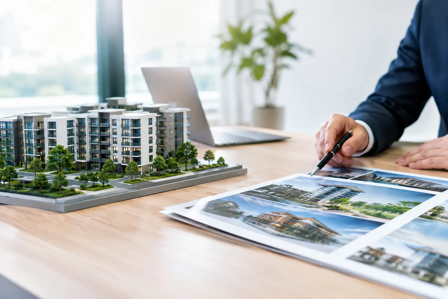
Property Development Branding Guide for Better Sales
A buyer may first encounter a development on a hoarding, a Rightmove listing, a brochure cover or a single CGI shared by an agent. Long before they visit the sales suite, they have made an instinctive judgement about quality, trust and desirability. A considered property development branding guide helps ensure that judgement is working in your favour.
For developers, house builders and marketing teams, branding is not a decorative layer added after plans are approved. It is the commercial framework that gives a scheme a clear position, a recognisable personality and a consistent presence from planning through to final release. Done well, it makes an unbuilt place feel credible, distinctive and worth enquiring about.
What property development branding needs to achieve
A development brand has a practical job to do. It must give prospective purchasers a reason to look twice, help agents explain the offer with confidence and provide a coherent system for every marketing asset. That includes the name, identity, CGI, signage, brochure, website imagery, floor plans and sales collateral.
The strongest brands do not rely on a fashionable logo or a premium colour palette alone. They express a real proposition. A city-centre residential scheme may need to communicate convenience, architectural confidence and investment appeal. A family-focused collection of homes may need to signal space, community and long-term value. A high-specification conversion may depend on heritage, rarity and finish.
The right answer depends on the audience, price point, location and product. A brand that feels suitably restrained for a luxury waterside scheme may appear distant or overly formal on a regional starter-home development. Positioning must be specific enough to create preference, but flexible enough to support every phase of marketing.
Start with the development, not the design
Before choosing typefaces or commissioning visuals, establish what the scheme genuinely offers and who needs to believe in it. This stage prevents a common problem: attractive creative work that has no clear commercial message behind it.
Begin by reviewing the development from a buyer’s perspective. Consider its location, architecture, tenure, amenities, specification, price bracket, competition and likely buyer motivations. Speak with the sales team, planners, architects and project leads where possible. They often hold different pieces of the story – the reason a material was selected, the benefit of the site layout or the local change that makes the address more appealing.
From there, define a concise positioning statement. It should explain what the development is, who it is for and why it deserves attention. This is an internal working tool rather than advertising copy. Its value lies in giving every creative decision a reference point.
For example, a scheme might be positioned around considered urban living for professionals who want access to the city without compromising on space. That direction can inform the tone of voice, image selection, interior styling, CGI camera angles and the emphasis placed on nearby transport or green space.
Naming should follow the same discipline. A name needs to be memorable, appropriate to the setting and practical to use across signage, digital campaigns and verbal sales conversations. It should not promise a lifestyle that the development cannot deliver. Research availability and potential confusion early, before the name becomes embedded in artwork and stakeholder discussions.
Build an identity with purpose
Once the positioning is agreed, the visual identity can give it shape. This usually includes a logo or wordmark, colour palette, typography, image direction, graphic devices and a tone of voice. The goal is not to create as many elements as possible. It is to create a system that remains recognisable when the logo is small, the brochure is viewed digitally or the campaign is reduced to a social media advert.
Typography is especially influential in property branding. It controls much of the perceived character of a scheme: architectural, established, contemporary, warm or refined. Colour should support that character while still working in practical formats such as site boards, print brochures and screen-based material. A pale palette can feel elegant, for instance, but it needs sufficient contrast to remain legible in real-world conditions.
Image direction deserves equal attention. Define whether photography and CGI should feel editorial, lifestyle-led, quietly luxurious, family-oriented or highly architectural. Without this direction, campaigns can become fragmented: an elegant brochure may sit alongside generic lifestyle imagery, while the CGI tells a completely different story.
A concise brand guideline document is useful here. It does not need to be an unwieldy manual. It should set out the approved assets, their intended use and the visual principles that protect consistency as more suppliers, agents and marketing channels become involved.
Make CGI part of the brand system
For off-plan and under-construction developments, CGI is often the most persuasive expression of the product. It should therefore be planned as part of the identity, not treated as a separate production task.
Exterior visualisations establish the first impression of scale, setting and architectural quality. Interior CGI can make layouts, finishes and light levels easier to understand. Site plans, floor plans and virtual tours provide the detail buyers need as their interest develops. Each asset has a different role, but they should all feel as though they belong to the same development.
This is where an integrated creative approach has clear advantages. When branding, graphic design and CGI are developed together, the colour treatment, materials, styling, typography and messaging can be coordinated from the outset. The result is more convincing than placing a finished render into a brand template after the fact.
Accuracy matters as much as atmosphere. Buyers, agents and stakeholders need visuals that represent the proposed scheme responsibly. Landscaping, views, furniture, lighting and surrounding context should be carefully considered rather than used simply to make an image more dramatic. Aspirational presentation is valuable; misleading presentation creates a different kind of attention.
Apply the brand across the buyer journey
A property brand proves its value through application. The same story should carry from the first awareness advert to the reservation pack, while adapting to the purpose of each format.
At launch, attention-grabbing assets such as a hero CGI, campaign advert, landing-page imagery and site hoarding may lead the work. As enquiries move forward, purchasers need more practical information: location maps, specification sheets, floor plans, availability materials and detailed brochure spreads. Later, sales-suite graphics, wayfinding and handover communications should maintain the same standard of care.
Do not treat printed and digital material as identical versions of the same thing. A brochure can reward slower reading, material samples and carefully paced imagery. Digital channels need clear hierarchy, fast comprehension and visuals that work at smaller sizes. The brand should remain consistent, but the content should respond to the way it is being used.
Consider the sales environment too. A well-designed suite, presentation screen, pull-up graphic or window display can make a development feel more established before construction is complete. Conversely, inconsistent documents, dated plans or poorly reproduced imagery can undermine the confidence created by premium CGI.
Protect consistency as the project evolves
Development marketing rarely stands still. Unit mixes change, new phases are released, planning conditions affect messaging and agents request fresh materials at short notice. A brand needs enough structure to cope with those changes without losing its character.
Set clear approval routes for artwork, copy and visualisation updates. Keep master files organised, agree who can issue brand assets and make sure sales partners are using current floor plans, specifications and imagery. This is operational discipline, but it has a visible effect on the buyer experience.
Budget should be considered in terms of reuse as well as initial production. A flexible identity, well-planned CGI programme and adaptable brochure system can support later phases more efficiently than repeatedly commissioning disconnected pieces of work. The cheapest initial route is not always the most cost-effective once revisions, reprints and inconsistent campaign materials are taken into account.
TDR Creative approaches this work as one coordinated process, bringing CGI visualisation and graphic design together so that a development can be presented with both precision and commercial focus.
Make the promise visible
The most effective development brands make a future place easier to understand and easier to want. They give purchasers a coherent picture before the building is finished, while giving sales teams the confidence to communicate its value at every touchpoint. Start with an honest proposition, carry it through every visual decision and give the detail the same attention as the first impression.
