Home » Office Fit-Out CGI Examples That Sell the Vision
Office Fit-Out CGI Examples That Sell the Vision
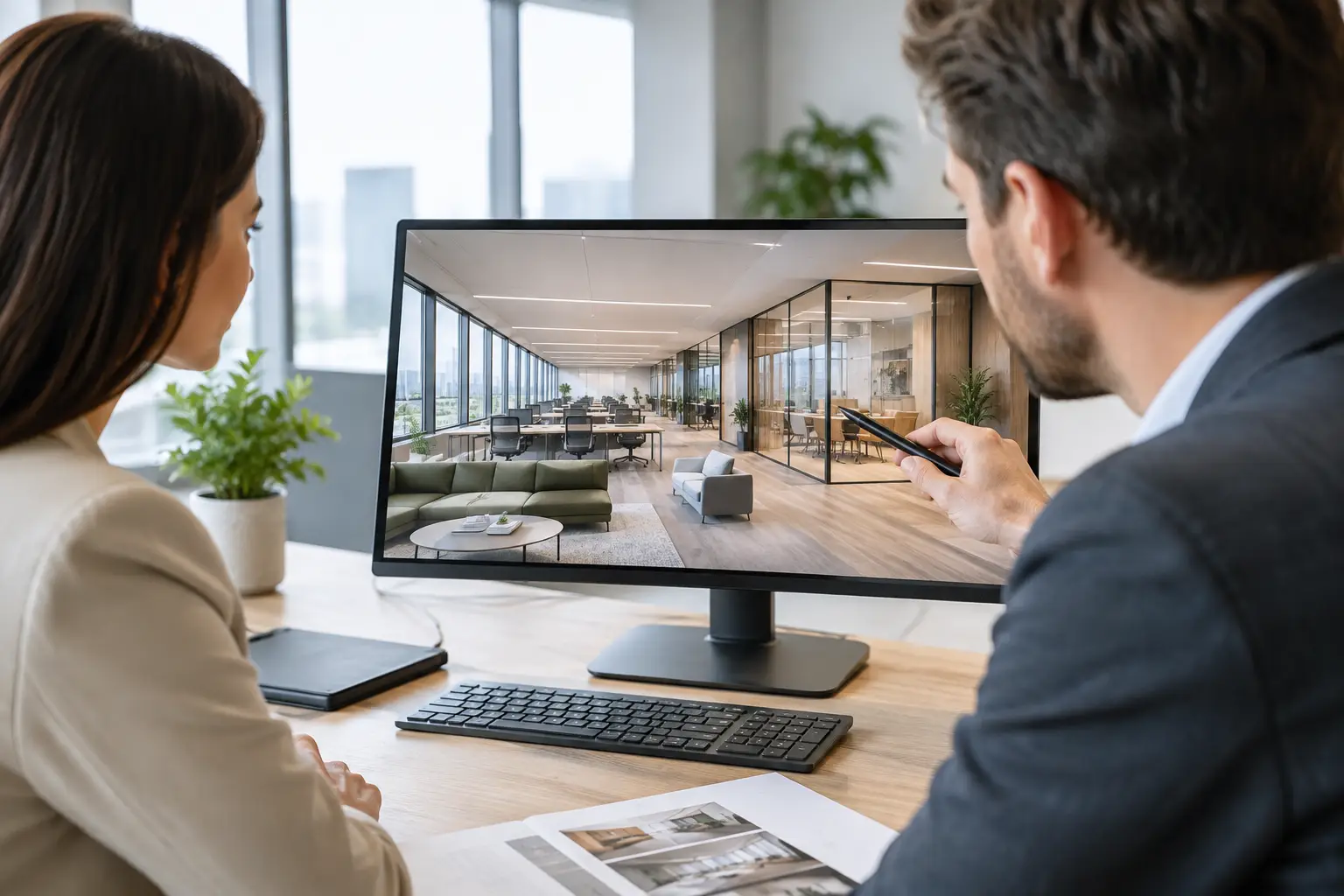
An empty floorplate rarely communicates the value of a workplace. Even a well-drawn plan can leave prospective tenants, investors and internal stakeholders asking the same question: what will it actually feel like to work here? Strong office fit-out CGI examples answer that question before a single desk, partition or pendant light is installed. They turn a proposal into a credible, commercially useful vision.
For landlords, developers, architects and workplace specialists, that difference can shape an occupier’s decision. A photorealistic image gives the viewer context for scale, atmosphere, circulation and brand personality. It also gives marketing teams an asset that can work across brochures, presentations, social campaigns, sales suites and leasing material.
What effective office fit-out CGI examples should show
The most convincing visuals do more than display attractive furniture. They show how a fit-out solves the practical and cultural needs of the business that will occupy it. A high-performing CGI image makes considered design choices visible: the relationship between quiet work areas and collaboration zones, the quality of natural light, the level of privacy in meeting rooms, and the details that give a workplace its identity.
An open-plan office visual, for example, should not feel like a showroom filled with identical desks. It needs believable spacing, appropriate task seating, screens or planting where they support focus, and small indications of real working life. Laptops, notebooks, coat storage and carefully selected people can add scale and energy, provided they do not distract from the scheme.
Reception CGI often has a different job. Here, the focal point may be a branded welcome desk, feature lighting, material palette or sightline into the wider workplace. The image should help a visitor understand the standard of the business within seconds. For a speculative fit-out, it should be polished enough to appeal broadly while retaining enough character to avoid looking generic.
A tenant-ready workspace
For a landlord marketing a refurbished building, CGI can show several potential approaches for the same floorplate. One version might present a clean, neutral CAT A+ workspace with meeting rooms and a tea point. Another may introduce a more expressive creative-studio style, with flexible benches, acoustic booths and informal breakout seating.
This approach is especially useful where the physical space is incomplete or currently unappealing. Rather than asking a prospective occupier to imagine past exposed services, empty rooms or construction activity, the marketing material shows a credible finished environment. The key is to make the proposal proportionate to the property, location and target tenant profile. An overly luxurious scheme can be as unhelpful as an underwhelming one if it creates the wrong expectation.
A branded headquarters concept
Where the office is designed around an established business, CGI should carry the brand beyond a logo on a wall. Colour, graphics, finishes, wayfinding and styling can all support the organisation’s character. A technology company may favour crisp detailing, adaptable collaboration settings and a refined, future-facing palette. A professional services firm may need a calmer reception, discreet client meeting spaces and a more formal material selection.
In these examples, visual consistency matters. The same thinking should flow into the pitch deck, leasing brochure, signage concepts and printed collateral. Combining CGI and graphic design within one studio helps maintain that standard, so the workplace is presented as one considered proposition rather than a collection of disconnected assets.
A workplace with distinct zones
A single hero image is useful, but it cannot carry the whole story. A well-planned office CGI set normally includes the spaces that influence everyday experience: reception, open-plan workstations, meeting rooms, breakout areas, kitchens, booths, focus rooms and circulation routes.
Each view should have a purpose. A wide-angle image can establish layout and scale; a closer view can show craftsmanship in joinery, upholstery, lighting or finishes. A meeting room visual may demonstrate privacy and client-facing quality, while a breakout scene can communicate culture and wellbeing. The value comes from building a coherent narrative of the workplace, not producing multiple images from similar angles.
How to plan office fit-out CGI for marketing value
The strongest results are shaped well before rendering begins. CGI is highly flexible, but it is most efficient when the client, designer and visualisation team agree what the images need to achieve. Is the purpose to let space before practical completion? Win approval for a refurbishment? Support a tender? Give employees confidence in an upcoming move? The answer affects the viewpoint, level of detail, styling and number of deliverables.
Start with the drawings and the intended audience. CAD plans, elevations, reflected ceiling plans, furniture schedules and material references provide the technical foundation. Early concept imagery can still work with incomplete information, but assumptions should be clearly identified. For a sales-led campaign, it may be better to prioritise compelling key spaces than to render every room at the same level.
Camera selection deserves proper attention. Eye-level views usually feel natural and place the viewer in the space, whereas elevated angles can be more useful for explaining a larger layout. Looking directly at a feature wall may suit a reception image; a diagonal view across a workspace can better reveal depth, daylight and activity. There is no universal right angle. It depends on what the image needs to communicate.
Lighting is equally strategic. Daylight-led images can make a space feel generous and connected to its setting, particularly when windows or city views are a selling point. Warmer interior lighting can bring atmosphere to hospitality-style breakout zones or evening event spaces. The goal is realism with intent: a bright image is not automatically a better image if it flattens materials or hides the mood of the design.
The details that make CGI believable
Photorealism depends on accuracy, not simply high resolution. Materials need the right scale and response to light. Timber should show grain direction; glazed partitions should have subtle reflections; fabric, metal and stone should not appear uniformly perfect. Small details such as shadow depth, cable management, socket placement and realistic chair proportions often separate a persuasive visual from one that feels computer-generated.
People are another judgement call. Adding figures can show occupancy, improve scale and make a workplace feel active. Yet too many figures, or figures placed without a believable purpose, can make the scene feel staged. For leasing imagery, a lightly occupied setting often gives viewers room to project their own team into the space. For a culture-led employer campaign, more visible interaction may be appropriate.
The same applies to styling. Plants, books, ceramics and desk accessories can soften a scheme and add credibility, but they should reinforce the client’s positioning. A financial firm, a design practice and a flexible workspace operator are unlikely to benefit from identical styling choices.
Using CGI beyond the initial presentation
Office fit-out visualisation earns more value when it is planned as part of a wider campaign. High-resolution stills can support printed brochures and presentation boards. Cropped details can be prepared for social content. Animated camera moves can create impact at a launch event, while 360-degree interactive tours give remote viewers a stronger sense of layout and flow.
There is a cost consideration. A larger package of views, formats and revisions requires more production time, so it is sensible to prioritise the assets that will have the longest commercial life. In some cases, four carefully selected images will outperform a broad set of average views. In others, a phased development needs a full visual toolkit that can be updated as occupiers, finishes or layouts are confirmed.
TDR Creative approaches office fit-out CGI as both a visual and marketing asset. The process blends creativity with precision, helping clients present unbuilt or evolving spaces with the quality needed for commercial decision-making. When CGI, brochures and brand materials are developed with the same visual direction, every touchpoint works harder.
A proposed office should never rely on a viewer’s imagination alone. Give them enough detail to understand the design, enough atmosphere to feel its potential, and enough clarity to take the next step with confidence.
