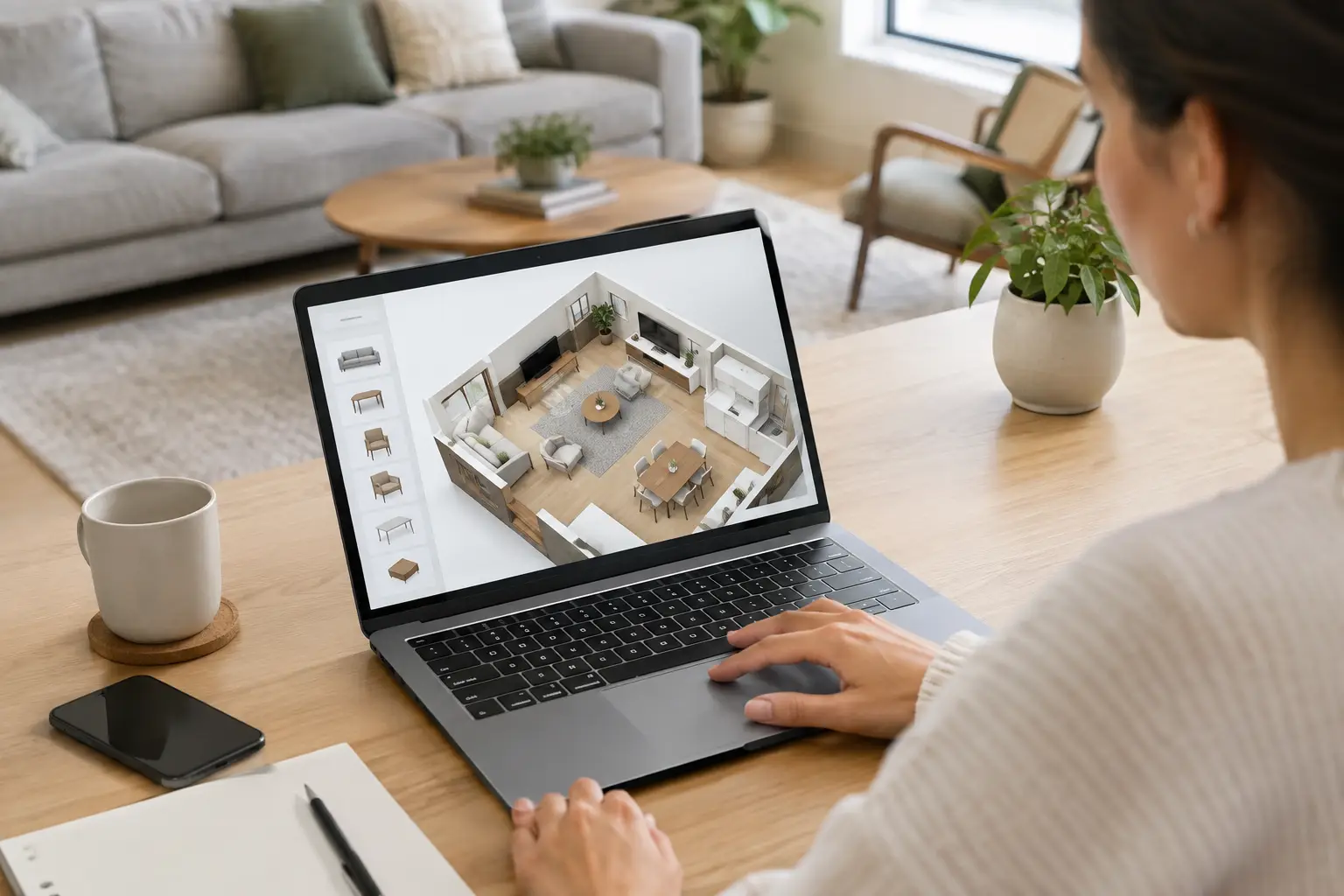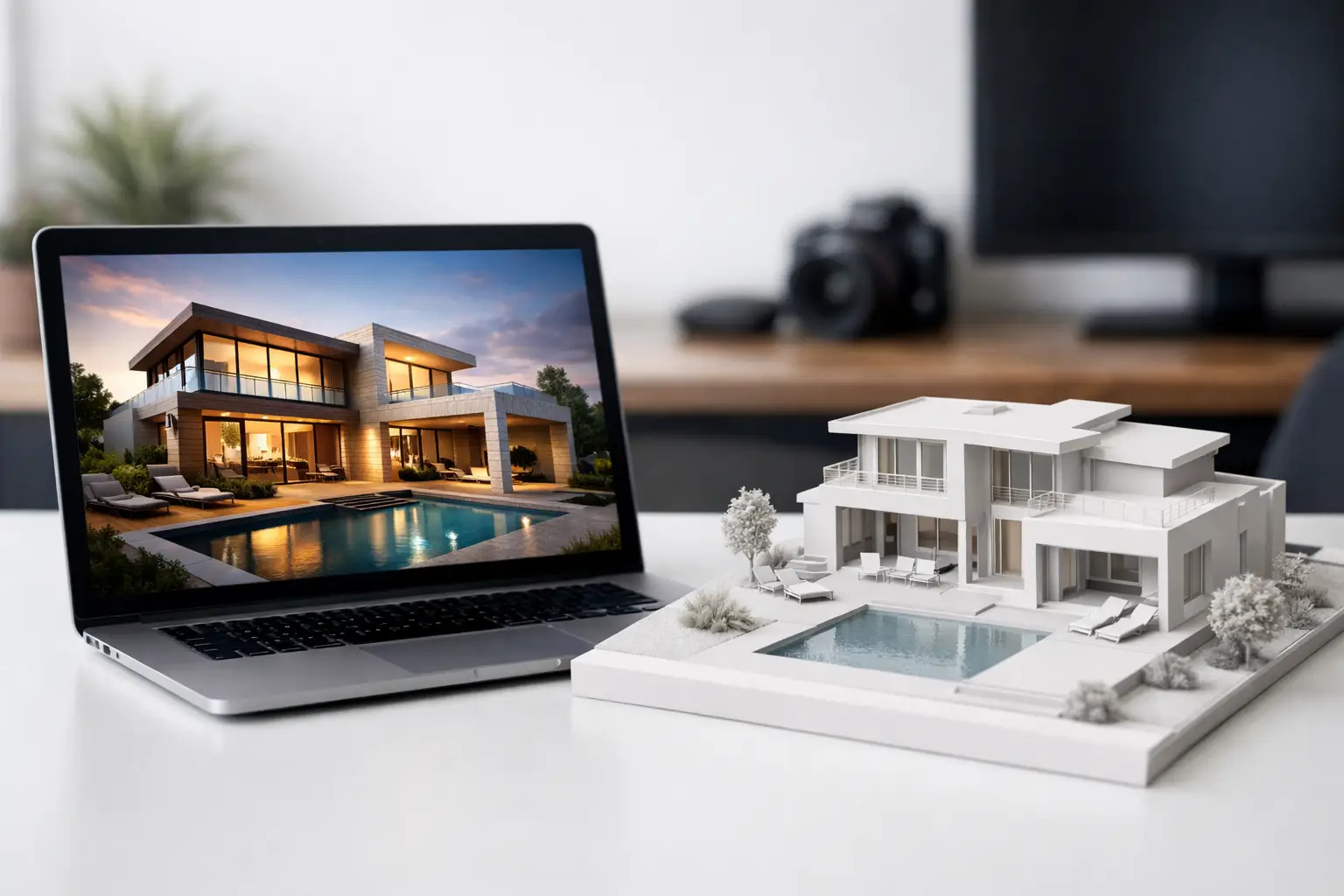
The Best Assets for Brand Refresh Campaigns

The Best Assets for Brand Refresh Campaigns

A brand refresh rarely fails because the new logo is weak. It fails because the work stops at the logo, while the brochure, property signage, sales suite, website imagery and social templates continue to tell different versions of the same story. Choosing the best assets for brand refresh work means prioritising the places where customers actually form an opinion, then making every one of them feel considered, connected and ready for commercial use.

For property, architecture and consumer-facing businesses, this is particularly important. A refreshed identity may need to sell a development before it is built, make a complex offer easier to understand, or give a growing business the confidence to compete at a higher level. The asset plan must therefore do more than look polished. It needs to support decisions, generate enquiries and give internal teams practical tools they will genuinely use.

Choosing the best assets for brand refresh

Start with the customer journey rather than a fixed deliverables list. A national housebuilder, for example, may need attention-grabbing site hoarding, aspirational CGI and clear sales literature long before a visitor reaches a show home. A consumer brand preparing for retail may need packaging, point of sale and product imagery to work together at the shelf. An architectural practice may get greater value from a disciplined proposal template, project sheets and a visual presentation system.

The right selection depends on where your brand is seen, who needs to use it and what action that person should take next. The strongest refreshes tend to cover three jobs: creating recognition, explaining value and making a purchase or enquiry easier.

Before commissioning production, audit current materials with some healthy commercial scrutiny. Which assets are public-facing and high-volume? Which are holding sales teams back? Which can damage perceived quality because they are out of date, inconsistent or difficult to adapt? A good studio partner can help turn this review into a phased plan, protecting budget while ensuring the most visible touchpoints are addressed first.

1. A visual identity system that works beyond launch day

The identity itself is the operating system for every other asset. This includes the logo suite, colour palette, typography, imagery direction, iconography and rules for layout. But the most useful brand guidelines are not a document that sits untouched in a shared folder. They show how the system behaves in real applications, from a small digital advert to a large-format sales board.

For businesses with several services, sites or product lines, this is where structure matters. A flexible identity can distinguish a new development, collection or campaign while retaining clear parent-brand recognition. Too much freedom creates fragmentation; too little can make communications repetitive and hard to tailor. The balance should be deliberate.

It is also worth agreeing practical specifications early. Define approved file formats, minimum logo sizes, print colours, accessible digital colour combinations and image treatment. These details protect quality when materials are being produced quickly by different suppliers or teams.

2. Brochures and sales collateral that turn interest into action

A brochure remains one of the most valuable assets in a brand refresh because it gives customers time and space to understand an offer. In property, it can bring together location benefits, specification, floor plans, lifestyle imagery and availability in one carefully paced piece of communication. For a brand-led business, it can clarify a proposition, demonstrate products and reinforce credibility after an initial meeting.

The format should match the buying process. A premium printed brochure can create confidence in a sales environment, while a lighter digital version may be more appropriate for early-stage enquiries or email follow-up. Both need a clear hierarchy: what is being offered, why it matters, how it differs and what happens next.

Do not treat a brochure as a container for everything the business knows. Overloaded pages dilute the strongest messages and make future updates expensive. Build a modular grid and a content structure that can accommodate changes without redesigning the entire document. This is especially useful for phased developments, price updates and evolving product ranges.

3. CGI and photography that make the promise believable

Visuals carry a disproportionate share of the work in a refresh. They set expectations before a customer reads a word, particularly when the product is aspirational, technical or not yet physically available. Photorealistic exterior and interior CGI can show how a development will sit in its setting, how daylight moves through a room and how a space might feel to live or work in.

The most effective imagery is planned as a campaign rather than commissioned as isolated hero shots. Consider the full set of needs: website banners, brochure spreads, paid social formats, press imagery, sales-suite displays and large-format signage. A considered image plan gives each view a purpose and avoids a familiar problem: one impressive rendering being stretched across every channel until it loses impact.

There is a trade-off between visual ambition and speed. A highly detailed CGI scene may be the right investment for a flagship launch, while virtual staging or a simplified product visual could serve a fast-moving listing more efficiently. The standard should remain high, but the level of production should match the commercial role of the asset.

4. Digital templates that keep everyday communications on brand

A refresh is only as strong as the materials produced after the launch. Social media templates, presentation decks, email banners, document covers and digital advertising formats give marketing teams a reliable framework for day-to-day activity. They also reduce the temptation to improvise with unsuitable fonts, colours or imagery when deadlines are tight.

Templates should not be overly restrictive. The aim is to provide recognisable consistency while leaving enough room for individual campaigns, new products and local messages. Clear template instructions matter as much as the design itself, particularly where several people will be producing content.

For larger organisations, a practical library may include versions for recruitment, project updates, event promotion, sales announcements and corporate communications. For smaller businesses, a focused set of core templates is often more valuable than an extensive suite that is never used. Adopt what your team can maintain well.

5. Physical environments and point of sale that reinforce confidence

A customer should not encounter a carefully refreshed website then arrive at a sales suite, reception area or retail display that feels disconnected from it. Physical applications make a brand tangible, and they are often where confidence is either built or lost.

For property marketing, this may include site signage, directional boards, window graphics, sales-suite panels, display maps and printed leave-behinds. For consumer brands, it could mean packaging, shelf-ready point of sale, exhibition graphics and display units. These assets need more than attractive artwork: they require technical accuracy, legibility at distance, correct material specifications and experienced print support.

Scale is critical. A graphic that works on screen can become unreadable on hoarding, and a subtle colour can reproduce inconsistently across substrates. Involving design and production expertise from the start helps prevent costly revisions at the point of installation.

Making brand refresh assets work as one system

The greatest return comes when every asset has a shared visual logic and a clear role in the campaign. A CGI image should feel at home in the brochure. The brochure should use the same language as the sales presentation. The presentation should support the messages seen on site and online. Consistency is not simply aesthetic discipline – it makes the brand easier to recognise and easier to trust.

This is where bringing CGI visualisation and graphic design together can be commercially useful. One coordinated team can align art direction, layouts, image production and print-ready outputs from the outset, rather than asking several suppliers to interpret the same brief independently. TDR Creative applies this joined-up approach to help clients manage complex campaigns with greater control over quality, timing and budget.

Measure the refresh against practical outcomes. Are enquiries better qualified? Are sales teams more confident presenting the offer? Are campaign materials faster to produce? Are customers spending longer with the brochure or interacting more with development imagery? Not every benefit will be immediately measurable, but these questions keep the work tied to business performance rather than personal preference.

A brand refresh does not need every possible asset on day one. It needs the right first set: the materials that make the new identity visible, credible and useful where decisions are made. Build those with care, then extend the system as the campaign, development or business grows.

How Long Do Renders Take for Property Marketing?

How Long Do Renders Take for Property Marketing?

A sales launch date is set, hoarding artwork is being prepared and prospective buyers need to see a scheme that is still months away from construction. At that point, one question shapes almost every marketing decision: how long do renders take? The honest answer is that it depends on the level of detail, the quality of the information supplied and how quickly decisions are made. However, a clear CGI process makes the timescale far more predictable.

For property developers, architects and marketing teams, a render is not simply an attractive image. It is a commercial asset that needs to communicate the right architecture, finish, lifestyle and brand position before a viewer has read a word of copy. Allowing enough time for creative development and approvals protects both the quality of the final visual and the momentum of the wider campaign.

How long do renders take in practice?

A single high-quality exterior or interior CGI image will commonly take around one to two weeks from a complete brief to final delivery. This includes time for interpreting drawings, building the scene, adding materials and lighting, producing a first draft, receiving feedback and completing final refinements.

That is a useful starting point, not a fixed rule. A straightforward flat interior using well-defined finishes may move quickly. A landmark mixed-use development with complex façades, extensive landscaping, multiple viewpoints and a detailed surrounding context will require longer. A suite of images can also be produced efficiently when scenes share the same model, but it should still be planned as a coordinated production rather than multiplied by the turnaround for one image.

As an indicative guide, early-stage massing or planning visuals may be ready within several working days where the model is simple and the brief is focused. Marketing-grade stills generally need one to two weeks. A complete campaign covering exterior CGI, interiors, aerial views, virtual staging, floor plans and brochure artwork should be scoped across several weeks, particularly where it must align with a sales launch or planning submission.

The most dependable timescale is one agreed after reviewing the available drawings, required outputs and approval process. It is better to establish a realistic production programme at the outset than to rush the final image at the stage where detail matters most.

What affects CGI render timescales?

The word ‘render’ can describe both the full creative process and the computer processing stage at the end. The latter may take minutes or hours, depending on the image size, complexity, lighting and render settings. In commercial CGI, though, most of the calendar time is spent before that final calculation begins.

The quality of the starting information

Accurate architectural drawings, elevations, material schedules and a clear site plan give the CGI team a dependable base. A coordinated 3D model can accelerate modelling, provided it reflects the current design and can be checked against the drawing package.

Where information is incomplete, the studio can still create compelling visuals, but assumptions must be agreed. A missing landscape plan, undecided cladding finish or unconfirmed kitchen specification can lead to additional investigation and amendments later. This does not mean every detail needs to be final before production starts. It means the brief should identify what is confirmed, what is indicative and who has authority to approve decisions.

The number and complexity of views

A carefully composed street-level hero image may require significant work on architecture, planting, people, vehicles, reflections and lighting. An aerial image introduces a wider context, neighbouring buildings and a greater need for accurate site placement. Interiors require their own decisions around furniture, styling, daylight, artificial lighting and the exact finishes that make a room feel credible.

Complexity is not only about the size of the development. A small, premium retail space can take longer than a larger but repetitive residential block if the product displays, joinery, surfaces and brand details are particularly exacting.

The required level of realism

Early concept visuals and planning imagery can be intentionally restrained. Their purpose is often to explain form, scale and design intent. Sales and investor marketing usually demands a more photorealistic finish, with believable materials, lived-in detail, considered atmosphere and a composition that supports the campaign message.

Neither approach is inherently better. The right choice depends on the audience and objective. What causes delays is asking a visual intended for early planning discussion to become a polished lifestyle campaign image late in the process without revisiting the scope.

Revisions and decision-making

Revisions are a normal and valuable part of bespoke CGI. The key is to structure them well. Feedback that is consolidated, specific and supplied by an agreed date allows changes to be handled efficiently. Feedback delivered in stages by several stakeholders can create avoidable rework, particularly if a material, viewpoint or design decision has already affected multiple scenes.

A useful approval route normally includes one lead contact, a clear number of review rounds and an agreed distinction between minor refinements and changes that alter the underlying model. Moving a chair or adjusting the warmth of the lighting is very different from revising balcony proportions or changing an entire façade system.

A typical production process

A professional CGI programme begins with a briefing session rather than a render button. The creative team reviews the project, target market, key selling points, architectural information, brand guidelines and required outputs. This stage establishes the views that will earn their place in the campaign, whether that is a dramatic arrival image, a kitchen-led lifestyle interior or an aerial view that explains connectivity.

The next stage is modelling and scene development. Architecture is built or checked, materials are developed, the landscape and context are added, and camera positions are selected. For an interior, this includes the balance of furniture, accessories and styling. For an exterior, it may include seasonality, sunlight direction and the type of activity that makes the scheme feel active without becoming distracting.

A draft image is then produced for review. It is the most important point for checking the fundamentals: building form, viewpoint, material direction, furniture selection, landscaping and overall mood. Once these are approved, the image moves into final detailing and high-resolution rendering.

At TDR Creative, this approach can also be coordinated with floor plans, brochures, site plans and wider brand collateral. Keeping CGI and graphic design within the same production conversation helps ensure that the image, layout, messaging and specification present one coherent story, rather than being assembled from disconnected assets at the end.

How to keep your project on schedule

The fastest route to a strong render is not cutting review time. It is creating clarity before production begins. Supply the latest drawing issue, flag any elements still under design and share the intended use of each image. A visual for a planning committee will be judged differently from one designed for a premium launch brochure or a property portal.

It also helps to agree the priority order. If the campaign needs one exterior hero image first, that can be scheduled ahead of supporting interiors. If a brochure has a fixed print deadline, work backwards from the date that final artwork must be supplied, allowing time for the CGI approvals that sit before it.

Reference images are valuable when used precisely. Rather than sending a broad collection of aspirational interiors, explain what each reference demonstrates: the level of styling, the colour palette, the quality of natural light or the type of buyer being represented. This gives the creative team direction without asking them to copy an unrelated scheme.

Finally, ensure the right people are available at the right milestones. A prompt, consolidated response to the draft stage is often what separates a smooth one-week refinement period from a delayed launch. If senior stakeholders are away, agree delegated sign-off before the project starts.

The right turnaround is the one that protects the idea

A credible render needs enough time to be accurate, persuasive and aligned with the wider marketing plan. The strongest visuals do more than show what will be built – they give buyers, investors and stakeholders confidence in what the project can become. Start the conversation early, define the decisions that matter and give the creative process room to turn a set of drawings into an image people can picture themselves in.

Ready to move your project forward with us – contact us for more information studio@tdrcreative.co.uk or call us on 0121 666 7446

See our CGI work for other developers – Transform the way you present your developments. → https://tdrcreative.co.uk/3d-creative-visuals/

Retail Display Design That Earns Attention

Retail Display Design That Earns Attention

A retail display has only a few seconds to make its case. Whether it sits at a shop entrance, on a promotional aisle end or beside a till, it must communicate the product, the offer and the brand with immediate clarity. Effective retail display design turns that brief moment of attention into a reason to stop, engage and buy.

For consumer brands and retail marketing teams, the display is not simply a printed panel or a fixture holding stock. It is a physical expression of a campaign. It needs to work within a busy environment, stand up to close inspection and give retailers confidence that it will be practical to install, replenish and maintain.

What retail display design needs to achieve

The strongest displays balance commercial purpose with visual impact. They help a customer understand what is being sold, why it is relevant and what action to take next. That sounds straightforward, but retail spaces are full of competing messages, changing light levels, varied store layouts and customers with limited time.

A successful display therefore begins with a clear hierarchy. The brand or campaign message should be recognisable at a glance, followed by the product benefit, offer or call to action. If every message is given equal visual weight, none of them will land. A concise headline, confident imagery and carefully controlled use of colour usually perform better than a crowded collection of claims.

The display must also feel credible for the brand. A premium skincare launch, a high-volume grocery promotion and a new home technology product may all need point of sale material, but they require very different visual languages. Material finishes, typography, photography, CGI and the amount of on-display copy should all support the intended market position.

Start with the retail environment, not the artwork

Retail display design is most effective when the physical setting is considered before creative production starts. A concept that looks impressive on a flat presentation board can fail when it is placed in a narrow aisle, partly obscured by stock or viewed from several metres away.

Start by establishing where the display will sit and how shoppers will approach it. An entrance display has the job of creating instant awareness, while a shelf talker must work at much closer range. A freestanding display needs to attract attention from multiple angles; a counter unit has to remain useful without disrupting staff or payment equipment.

Store requirements matter just as much. Retailers may have limits on footprint, height, weight, materials, fire ratings or installation methods. Stock levels and replenishment routines will shape how the unit is built. Ignoring these factors until late in the process can mean expensive redesigns or a display that becomes less effective once products are added.

This is where coordinated planning between brand, marketing, design, production and retail teams pays off. A clear brief should define the campaign objective, retail locations, display format, product range, audience, timing, budget and measures of success. It gives the creative work a commercial foundation rather than treating design as decoration.

Build a message hierarchy shoppers can read quickly

Customers rarely read a retail display in the same way they would read a brochure. Their attention moves quickly, often while they are already focused on finding a product or completing a purchase. The message needs to be structured for scanning.

At a distance, the display should communicate the brand, category or campaign promise. At closer range, it can reveal product details, a price-led offer, ingredients, technical features or a promotional mechanic. The final layer may include a QR code, product comparison or call to action, but only where it offers genuine value. Adding a code because it is available is not a strategy.

Visual contrast is essential. A strong difference between text and background improves legibility, while a single focal image or product render can direct the eye. Type should remain readable at the intended viewing distance, particularly where the display is placed in high-traffic or brightly lit areas. Small type, low-contrast colours and overworked layouts are common causes of displays being seen but not understood.

There is a trade-off to manage. Retail teams often need to include product information, promotional terms and brand assets, particularly for regulated categories. The answer is not necessarily to remove detail. It is to place detail where it supports the customer decision, rather than allowing it to obscure the main message.

Use visuals that make the product easier to choose

High-quality visuals do more than make a display look polished. They show customers what a product is, how it fits into their lives and why it deserves attention. The right creative approach depends on the product and the campaign objective.

Photography can bring warmth, authenticity and human connection, particularly where lifestyle context matters. Product CGI offers control where photography is impractical, where products are still in development or where multiple variants need to be shown consistently. It can also help teams test packaging, finishes, display layouts and campaign imagery before physical production begins.

For products with technical detail, a carefully considered cutaway, exploded view or close-up render may explain a benefit faster than a paragraph of copy. For seasonal launches, striking campaign imagery can create the necessary mood without requiring a full visual overhaul of the product packaging.

Consistency matters across every element. If the display artwork, packaging, brochure, social campaign and retailer presentation use different visual treatments, the brand loses recognition at the point where purchase decisions are made. Combining CGI and graphic design within one creative process helps maintain the same standard of imagery, colour, typography and message from concept through to print-ready artwork.

Design for production, installation and the real world

The quality of a retail display is judged in use, not just in an approval PDF. Production choices influence durability, perceived value, environmental impact and cost. Cardboard and corrugated board can be cost-effective for temporary campaigns and easier to recycle, while acrylic, metal, timber or fabricated structures may better suit longer-term installations. Neither route is automatically better. The choice should reflect campaign lifespan, retailer conditions, volume and brand position.

Print finishes also need a practical rationale. Foils, spot varnishes, embossing and specialist stocks can create a premium effect, but they may add cost and lead time. In a high-volume promotional rollout, a simpler finish with excellent artwork and colour control may deliver stronger value. Equally, a flagship launch may justify tactile materials that make the display feel considered and distinctive.

Artwork should be checked against final dimensions, print processes and viewing conditions. Colours that appear vibrant on screen can shift in print, especially across different substrates. Product imagery needs sufficient resolution at its intended scale, while cutters, folds, joins and fixtures should be accounted for from the outset. These technical details are part of the craft, and they protect the quality of the final installation.

Test the concept before committing to a rollout

A retail display can be expensive to amend once it has entered production. Early visualisation is therefore a useful decision-making tool, particularly for new fixtures, complex POS campaigns or displays intended for multiple retail formats.

CGI visualisation can place a proposed display in a realistic retail setting before a prototype is produced. It helps stakeholders assess sightlines, footprint, product capacity, lighting, branding prominence and the relationship between the unit and its surroundings. This is especially valuable when senior teams, retailers or distributors need to approve a concept before manufacturing begins.

A physical prototype still has an important role where touch, assembly and structural performance are critical. The most reliable approach often combines both: use CGI to refine the creative direction and presentation, then produce a prototype to validate materials, build quality and practical handling. That process reduces uncertainty without delaying every decision until a physical unit is available.

Measure the display against its commercial purpose

A display should be evaluated by more than whether people like how it looks. The appropriate measure depends on the campaign. For one brand, increased sales of a featured line will be the priority. For another, it may be trial, sampling, new product awareness, basket value or retailer adoption.

Before launch, agree what success looks like and capture a baseline where possible. Store feedback can reveal whether the display was easy to install and replenish. Sales data may show performance by location or format. Customer observation can identify whether shoppers notice the unit, understand the offer and interact with the product.

Those findings should inform the next campaign. A display that delivers strong awareness but weak conversion may need a clearer price message or product benefit. One that performs well in larger stores may need a different footprint for convenience locations. Good retail display design develops through evidence as well as creative judgement.

For brands planning a rollout, the value lies in bringing strategic thinking, visual craftsmanship and production awareness together from the beginning. TDR Creative approaches that process as one coordinated creative service, helping teams develop display concepts and supporting visuals that remain commercially focused at every stage.

The best display is not necessarily the largest, brightest or most elaborate. It is the one that gives the right shopper a clear reason to pause, understand and choose – while representing the brand with the quality the product deserves.

Ready to move your project forward with us – contact us for more information studio@tdrcreative.co.uk or call us on 0121 666 7446

See our CGI work for other developers – Transform the way you present your developments. → https://tdrcreative.co.uk/3d-creative-visuals/

CGI Interiors Versus Show Homes – Which Works?

CGI Interiors Versus Show Homes - Which Works?

A buyer may first encounter a new home while it is still a concrete frame, a fenced-off plot or a site plan on a sales-suite wall. That makes the choice between CGI interiors versus show homes more than a presentation decision. It affects launch timing, marketing spend, buyer confidence and how clearly people can picture themselves living in the development.

For house builders, developers and their marketing teams, neither option is automatically the right answer. A show home creates a physical experience that can be highly persuasive at the point of sale. Interior CGI creates a controlled, flexible and scalable sales asset long before a plot is ready for viewings. The strongest approach depends on the development, the buyer, the sales strategy and the stage of construction.

What a show home does best

A professionally dressed show home gives prospective buyers something tangible. They can walk through the rooms, understand the relationship between spaces, assess natural light and get a feel for the quality of finishes. For buyers making a significant commitment, that physical reassurance matters.

It can also establish the desired tone for a development. Thoughtful furniture, styling and accessories give a room warmth and aspiration, helping buyers associate an otherwise empty property with a particular lifestyle. On higher-value schemes, or developments where fit and finish are a major part of the proposition, this can support the premium being asked.

A show home is particularly effective when the site has regular footfall and the sales team can use it as a practical conversation tool. A buyer can stand in a kitchen, discuss upgrade options and move straight into questions about availability, completion dates or incentives.

There are limitations, however. A physical show home represents one layout, one plot type and one carefully selected interior scheme. It cannot easily show alternative kitchens, flooring packages, colour palettes or the view from every flat. Once installed, changing the presentation takes time, coordination and further budget.

Where interior CGI earns its place

Interior CGI turns plans, specifications and design intent into a photorealistic view of a finished home. It allows a scheme to be marketed before construction is complete, allowing the sales campaign to begin earlier and work harder for longer.

The commercial advantage is not simply that CGI looks polished. It is that the same approved visual can be adapted across brochure spreads, sales-suite displays, property portals, social content, email campaigns and presentations. A coordinated set of images can show each key room, multiple house types and the details that distinguish the scheme without repeatedly building and dressing physical spaces.

CGI also provides much greater control. The camera angle can be selected to explain an awkward layout. Lighting can reflect the intended character of the room. Furniture can be scaled accurately, and materials can be matched to a confirmed specification. Where buyers are choosing between packages, separate visual sets can demonstrate the difference clearly rather than leaving the decision to imagination.

This flexibility is valuable on flat developments, where many homes share a base layout but differ in orientation, outlook or finish. It is equally useful for a development with several buyer profiles. A city-centre flat may benefit from a confident, contemporary look, while a family house can be styled around practical everyday living. The architecture remains consistent, but the visual story becomes more relevant to its audience.

CGI interiors versus show homes: the cost and timing question

A show home has costs beyond furniture and styling. There may be fit-out works, rental or purchase costs, installation, maintenance, cleaning, utilities, insurance and the opportunity cost of taking a completed unit out of stock. If the property is sold later than comparable plots, that should be factored into the overall calculation.

CGI involves an upfront creative investment, but it is generally easier to scale. Once the architectural information, materials and core design direction are agreed, additional views, alternative finishes and selected variations can be produced without the physical logistics of refitting a home. It also avoids waiting until a suitable plot is complete.

That does not mean CGI is always less expensive in every situation. A single simple image may be cost-effective, but a substantial campaign with numerous house types, bespoke styling, animation and interactive content requires a properly planned budget. The key comparison is not the cost of one image against one room. It is the cost of creating enough high-quality material to sell the development effectively across its full marketing cycle.

Timing is often the deciding factor. If off-plan sales are needed to support funding, build momentum or meet a launch deadline, interior CGI gives the sales team credible material while the site is still progressing. A show home may follow later, reinforcing the campaign when buyers are able to experience the product in person.

The buyer experience is different, not lesser

There is a temptation to treat CGI as a substitute for a real room. It is better understood as a different sales tool with different strengths.

A show home answers the emotional question: what will it feel like to be here? CGI answers the visual and practical questions: what will this home look like when finished, how might this layout work, and what can I expect from this specific plot or specification?

High-quality CGI can be especially persuasive for buyers who begin their search online. Before they book an appointment, they want to understand the offer quickly. Empty-room photography rarely achieves this, particularly during construction. A considered CGI interior gives them a reason to enquire, while floor plans, site plans and clear specifications supply the supporting detail.

Accuracy is essential. Photorealism should never come at the expense of honest representation. Room proportions, ceiling heights, window positions, finishes and included items must be checked against the latest approved information. Where furniture, accessories or upgrades are illustrative, the marketing material should make that distinction clear. Credibility is harder to win than attention, and far more valuable.

When a hybrid approach delivers more value

For many developments, the most strategically effective answer is not choosing one over the other. It is using CGI early to build interest and using a show home later to convert buyers who want physical reassurance.

The campaign can begin with interior and exterior CGI, supported by accurate floor plans, site plans and branded sales collateral. As the build programme advances, 360-degree interactive tours or animation can add depth for remote buyers and investors. Once a show home is available, it becomes an additional proof point rather than the sole source of visual material.

This approach also prevents the show home from carrying too much responsibility. It may be perfectly styled for one house type, but CGI can continue to explain the full range of plots, flats and options. The result is a more consistent buyer journey, from first online impression to sales-suite visit and reservation.

Choosing the right route for your scheme

The practical decision comes down to a few connected questions. How early must the development be marketed? How many property types and finish options need to be communicated? Is the target audience likely to visit the site before reserving? Does the scheme rely on a premium, tactile experience, or does it need broad online reach at pace?

A smaller, near-complete development with a focused local buyer pool may gain most from an exceptional show home and a concise set of supporting visuals. A large phased scheme, block of flats or off-plan launch will usually benefit from a wider CGI programme, because it needs to sell variety before every plot can be seen.

The quality of execution matters whichever route is selected. A poorly dressed show home can make a good property feel generic. Equally, CGI that is inaccurate, over-styled or detached from the brand can create doubt rather than desire. The work needs to blend creativity with precision, with design decisions serving the sales objective rather than distracting from it.

At TDR Creative, this is where an integrated studio approach can make a material difference. Interior CGI, floor plans, brochures and campaign graphics can be developed around the same visual direction, helping buyers receive a consistent message at every stage.

The most useful question is not whether CGI or a show home is better. It is which combination will give buyers enough confidence to act, while giving the development the strongest possible start in market.

How the Property CGI Briefing Process Works

How the Property CGI Briefing Process Works

A prospective buyer may only spend a few seconds looking at a development image, yet that image can shape their view of the scheme, the location and the quality of the finished homes. A well-managed property CGI briefing process gives those visuals the strongest possible start. It reduces avoidable revisions, protects programme dates and ensures the final imagery works as a sales and marketing asset, rather than simply an attractive render.

For developers, architects and marketing teams, the brief is where commercial intent meets technical detail. The more clearly that balance is established at the outset, the more accurate, persuasive and cost-effective the production will be.

Start with the marketing objective

Before discussing camera angles, cladding samples or planting styles, establish what the CGI needs to achieve. An exterior image for planning consultation has a different job from a hero visual for a launch brochure. A set of interiors aimed at off-plan purchasers needs to communicate lifestyle and room scale, while imagery for a contractor or investor presentation may need to demonstrate design quality and delivery confidence.

A useful brief identifies the audience, the channel and the action the visual should encourage. For example, a house builder may need a street scene that creates confidence in the development as a place to live. An estate agent may need a collection of carefully selected interiors to support early enquiries. A marketing team may need a full suite of visuals that can be used consistently across hoarding, brochures, social campaigns, sales presentations and digital advertising.

This context helps the creative team make better decisions about composition, lighting, styling and the level of detail required. It also prevents a common issue: commissioning a technically accurate image that does not quite speak to the intended buyer.

Provide the right source material

The quality of a CGI brief is not defined by the volume of information supplied. It is defined by whether the material is current, coordinated and sufficiently detailed for the proposed stage of marketing. The most useful starting point is usually a drawing package containing site plans, floor plans, elevations and relevant sections, supported by a location plan or survey information for exterior views.

Where available, include the architectural specification, material schedules, landscape proposals, kitchen and bathroom selections, lighting layouts and any manufacturer references. If certain details are still being finalised, state this clearly. A CGI artist can work from assumptions where necessary, but those assumptions should be agreed rather than discovered during a late-stage review.

For exterior property CGI, photographs of the existing site and surrounding streets are particularly valuable. They assist with context, levels, neighbouring buildings, road layouts and the local character that makes an image believable. For refurbishment schemes, photographs of retained features, existing façades and key views can be just as important as drawings.

Do not wait for every decision to be final

Projects rarely reach a point where every finish has been signed off before marketing materials are needed. That does not have to delay production. The practical approach is to separate fixed information from provisional choices, then identify what must be confirmed before final sign-off.

A sample board, a marked-up PDF or a short schedule of assumptions can be enough to keep progress moving. What matters is visibility. If the brick type, balcony treatment or flooring choice may change, the team can plan the work accordingly and advise where a later amendment could affect cost or timing.

Define the views before production begins

One of the most commercially important parts of the property CGI briefing process is selecting the right views. More images do not automatically create a better campaign. A focused set of visuals, each with a clear purpose, will usually work harder across sales and marketing materials.

For a flat development, that might mean a landmark exterior, an arrival view, a principal living space, a kitchen-dining scene and a key bedroom. For a larger housing scheme, the priority may be a streetscape, a view showing landscape and public realm, a representative house type and selected interiors. The right mix depends on the sales strategy, programme and budget.

It is helpful to mark proposed viewpoints on drawings or share reference imagery that demonstrates the desired feeling. Reference images should guide mood, framing and aspiration rather than be treated as a template to copy. A strong CGI needs to reflect the specific architecture, location and brand of the project.

Consider where each image will appear

An image intended for a double-page brochure spread requires a different composition from one designed for a vertical social advert or a large hoarding panel. Flag the likely formats at briefing stage, including any need for cropped versions, text space or multiple aspect ratios.

This is also the point to consider the wider campaign. When CGI, floor plans, site plans, brochures and branding are being developed together, the visual direction can be coordinated from the start. A single studio team can align colour, typography, image treatment and layout so that every buyer touchpoint feels part of the same development story.

Agree the visual direction and level of finish

Photorealism is a baseline expectation, but not every project calls for the same visual treatment. Some schemes benefit from bright, welcoming daylight that suits family housing. Others may call for a more architectural mood, dusk lighting or a refined editorial feel that supports a premium city-centre proposition.

The brief should cover season, time of day, weather, occupancy and styling. Consider whether the exterior should show mature landscaping, people, vehicles and activity, or a more pared-back architectural presentation. For interiors, discuss the intended purchaser profile and price point. Furniture, artwork, accessories and lighting all influence how a room is perceived.

There are trade-offs. Highly detailed scenes with bespoke modelling, complex landscaping and extensive post-production can create exceptional campaign imagery, but they require more production time than straightforward marketing views. Equally, an overly minimal scene can make a space feel less lived-in or less relatable. The best route is the one that matches the importance of the image and its planned lifespan.

Set a clear review and approval route

CGI projects move most efficiently when feedback is consolidated. A nominated client lead should collect comments from architects, developers, sales teams and other stakeholders, then return one clear set of instructions. Conflicting comments from several reviewers can introduce uncertainty and slow the programme.

A structured approval route normally begins with camera angle and massing, followed by materials, lighting, landscape, furniture and final retouching. At each stage, reviewers should focus on the decisions relevant to that stage. There is little value in debating cushion colours before the kitchen layout and view direction are approved.

It is sensible to agree the number of revision rounds and the turnaround expected from each side. This keeps decision-making proportionate and allows the production schedule to remain dependable. Late design changes can still be accommodated in many cases, but the impact should be assessed honestly, particularly where a change affects multiple images or animation frames.

Specify deliverables and programme early

A briefing conversation should finish with practical agreement on what will be supplied: image quantity, resolution, file format, orientations and delivery dates. Marketing teams may need high-resolution files for print, web-ready versions for digital use and crops for particular advertising placements. Animation, 360-degree tours and virtual staging have their own technical requirements, so they should be identified at the start rather than added at the final hour.

Programme planning matters most when CGI supports a broader launch timetable. Brochure artwork, press advertising, sales-suite graphics and print production often depend on approved imagery. Working backwards from launch dates allows time for creative development, stakeholder review and final artwork without putting unnecessary pressure on the final week.

At TDR Creative, property CGI and graphic design can be managed as one coordinated process. That is particularly valuable where imagery must move directly into sales collateral and branded campaign materials, with no loss of consistency between the visual and the finished design.

Brief for confidence, not just completion

The strongest CGI briefs do more than provide instructions. They give the creative team enough commercial and architectural understanding to make considered choices throughout production. They clarify what cannot change, where there is flexibility and what the audience needs to feel when they see the finished image.

If drawings, specifications or marketing objectives are still evolving, bring the CGI partner into the conversation early. A short, well-structured briefing discussion can expose missing information, identify the most valuable views and create a clearer route from design intent to a persuasive property campaign.

How Product Render Quality Drives Better Decisions

How Product Render Quality Drives Better Decisions

A product can be beautifully designed, intelligently engineered and commercially well positioned, yet still struggle to earn attention if its imagery feels artificial. Product render quality is not simply a question of making a CGI image look impressive. It is what allows customers, buyers, investors and internal stakeholders to understand the product quickly, trust what they are seeing and make a confident decision.

For brands launching a new range, presenting packaging concepts or selling products before photography is possible, the render often becomes the product’s first real encounter with its audience. Every material, reflection, join, edge and shadow contributes to that encounter. If one element feels unconvincing, it can weaken the perception of the whole brand.

What Product Render Quality Really Means

High-quality product CGI is not defined by resolution alone. A large image with inaccurate materials, poor lighting or awkward proportions will still feel unpolished. Equally, a technically accurate model can appear flat if it has not been composed with the product’s purpose, audience and sales environment in mind.

Product render quality comes from several disciplines working together: precise modelling, convincing material definition, controlled lighting, accurate colour, thoughtful camera placement and careful post-production. The best work is designed to communicate rather than merely to demonstrate software capability.

For example, a premium skincare bottle needs to convey tactile qualities such as frosted glass, a subtle liquid level and the weight of a metal cap. A furniture render may need to show the weave of a fabric, the warmth of timber and how a piece sits naturally in a room. A technical product needs clean geometry and enough visual clarity to make its function immediately legible. The level of detail matters in each case, but the detail that matters most will change.

Photorealism must serve the brief

Photorealism is valuable because it removes doubt. It helps a customer imagine a product in their own setting and gives a marketing team material that can sit credibly alongside photography. But photorealism is not always the only objective.

A product launch may need a highly polished studio render for a brochure, a simplified cutaway image for a sales presentation, or a more stylised visual for a social campaign. The right approach depends on where the image will be used and what the viewer needs to understand. Quality means choosing the appropriate visual language, then delivering it with precision.

Why Product Render Quality Has Commercial Value

Marketing imagery has a short window in which to communicate value. Buyers rarely inspect every detail at first glance, but they quickly register whether an image appears credible, premium and consistent with the price point being asked.

Poor CGI can create avoidable friction. Materials may look plastic when they should look tactile. Reflections may ignore the environment. Labels can appear to float above packaging. Scale can feel wrong. These details are often noticed instinctively rather than consciously, but their cumulative effect is real: the product feels less considered.

By contrast, well-executed product renders can support commercial activity long before a physical sample, final prototype or photography shoot is available. They allow teams to develop campaign concepts earlier, prepare retailer presentations, test packaging directions and populate brochures, websites, point-of-sale materials and sales decks with consistent imagery.

This is particularly useful where time to market is tight. Rather than waiting for manufacturing, shipping and studio photography, brands can begin building a visual toolkit from approved designs. Revisions are also more manageable at this stage. Changing a label finish, cap colour or surface treatment in CGI is generally more efficient than reshooting physical products after a decision has changed.

The Details That Make a Render Convincing

Accurate geometry and proportion

The model is the foundation of the image. Product dimensions, seams, mould lines, panel gaps, fixings and edge profiles all affect realism. A render does not need to show every internal component, but visible forms must be accurate enough to withstand close scrutiny.

Reference material is essential. Technical drawings, CAD files, physical samples and measured photographs each help establish the correct form. When those assets are incomplete, a collaborative review process becomes even more important. Assumptions made early in modelling can become costly if they are discovered only at final artwork stage.

Materials with real-world behaviour

Material quality is often where otherwise competent CGI falls short. A brushed metal finish reflects light differently from polished chrome. Matte packaging has a different response from uncoated paper. Timber needs variation in grain, not a repeated texture. Glass requires believable thickness, refraction and transparency.

Good material work is controlled, not exaggerated. Too much surface texture can make a product look worn or poorly manufactured; too little makes it feel computer-generated. The aim is to represent the product at its intended standard, whether that is refined luxury, durable utility or accessible everyday design.

Lighting that gives form and meaning

Lighting establishes mood, but its practical role is to reveal shape, finish and hierarchy. A glossy object needs reflections that describe its curves. A dark product needs separation from its background without losing its intended colour. A translucent item may need backlighting to make its material understandable.

Studio-style lighting is often the right choice for ecommerce and catalogues because it creates clean, repeatable imagery. Lifestyle lighting can be more persuasive when context is part of the sale. A kitchen appliance, for instance, may benefit from an environment that demonstrates scale and use, while a close product shot can focus attention on its finish and features.

Composition and camera perspective

The camera should make the product easy to read. Overly dramatic angles can create visual impact, but they can also distort proportion or hide key features. Straight-on views, three-quarter angles, detail crops and contextual shots each have a role in a considered image set.

A useful CGI brief identifies the decision each image needs to support. Is the viewer comparing colourways? Assessing product size? Understanding a mechanism? Responding to a premium brand position? The answer shapes the camera plan more effectively than asking simply for ‘a few renders’.

Setting the Right Standard for Each Channel

Not every asset needs the same level of detail, and treating them all identically can waste budget. A hero image for a printed brochure or trade stand deserves close material work, high-resolution output and time for careful art direction. A small web thumbnail may require a simpler setup, provided it still matches the wider campaign.

Consistency is what turns individual images into a recognisable product story. Background treatment, lighting direction, colour management, camera style and retouching should work together across packaging, brochures, digital advertising and point-of-sale artwork. This is where a combined CGI and graphic design studio can bring practical value: visual decisions do not need to be translated between separate suppliers.

At TDR Creative, the goal is not to add detail for its own sake. It is to create product visuals that meet the brief, work across their intended formats and remain aligned with the wider brand presentation.

A Better Brief Produces Better CGI

A strong product render begins before the first polygon is modelled. The most effective client briefs give the creative team a clear commercial context alongside technical source files. They explain the audience, intended channels, deadlines, product variants, required views and any non-negotiable brand guidelines.

It also helps to establish the approval route from the outset. Who signs off product accuracy? Who approves brand colour? Who has the final say on composition? A clear review structure prevents late-stage feedback from becoming contradictory or unnecessarily expensive.

Reference imagery is useful, but it should be used carefully. A competitor image may show a lighting style worth considering without being appropriate to copy. A moodboard can communicate the desired level of luxury or energy, but it should be balanced with specific information about the product itself. The objective is a distinctive image that belongs to the brand, not a close imitation of an existing campaign.

Common Compromises and When They Work

Budget and deadline pressures are genuine, and the answer is not always maximum-detail CGI. Sometimes a simpler render is entirely appropriate. If a concept is still being tested, fast visualisation can help a team make decisions before committing to a refined final asset. If the product will only appear small on screen, micro-detail may add little visible value.

The risk comes when an early-stage visual is used as finished marketing artwork without the final quality pass. The product may be approved internally, but the image is then asked to carry a public-facing campaign. Separating concept visuals from production-ready renders gives teams a clearer route to manage cost without lowering the perceived standard.

Good planning also allows one well-built product model to work harder. Once approved, it can be adapted for colourways, close-up details, lifestyle settings, animation, packaging visuals and campaign layouts. That is where CGI becomes an efficient long-term asset rather than a one-off image.

When product imagery is treated as part of the sales journey rather than a final decorative layer, decisions become clearer. Invest detail where customers need reassurance, keep visual standards consistent across every touchpoint, and give the product the same care in presentation that went into designing it.

Sales Suite Design That Makes Developments Feel Real

Sales Suite Design That Makes Developments Feel Real

A buyer may spend less than half an hour in a sales suite, yet the impression formed there can shape a six-figure decision. Plans, finish samples and a site map all need to work hard, but they only become persuasive when they help someone picture a life, not simply understand a specification. Effective sales suite design turns an unbuilt development into something buyers can trust, compare and want to reserve.

For house builders, developers and marketing teams, the challenge is rarely a lack of information. It is deciding what to show, in what order, and how every visual element should support the sales conversation. The strongest suites blend creativity with precision: they are attractive enough to create an emotional response, practical enough for a sales team to use every day, and consistent with the development’s wider campaign.

Sales suite design begins with the buyer journey

A sales suite should be planned around the questions a buyer asks, often before they say them aloud. Where is the development? What will my home look like? Which plot suits my needs? What is included? Can I trust this developer to deliver what has been promised?

The room, its graphics and its digital tools should answer these questions in a clear progression. A visitor needs a quick sense of the development first: its setting, architecture, lifestyle and overall quality. They can then move into the detail of individual homes, plots, interiors and upgrades. If a buyer is shown a dense site plan or a long list of specifications too early, the experience can become transactional before the development has had a chance to feel desirable.

This does not mean every suite needs the same format. A city-centre flat scheme may need to foreground location, views, amenities and compact-space living. A family housing development may lead with gardens, schools, room for everyday life and the distinction between house types. For a premium scheme, materiality and a carefully controlled sense of exclusivity may matter as much as the information itself.

The practical starting point is a buyer journey map. Identify the moments that build confidence, the decisions that need visual support and the points at which a sales adviser needs a useful prompt. This gives the creative work a commercial purpose and prevents the suite becoming a collection of attractive but disconnected display boards.

Build one visual system across every touchpoint

A sales suite is not separate from the rest of the marketing campaign. It is the physical place where CGI, branding, brochures, site plans, floor plans and sales materials need to meet without contradiction. When exterior images show one architectural character, the brochure suggests another, and the suite uses different colours or messaging, buyers notice. Even if they cannot identify the inconsistency, it can dilute confidence.

A coordinated visual system begins with the development brand: the name, logo, colour palette, typography, tone of voice and image direction. That identity should carry through to welcome signage, window vinyl, wall graphics, literature, digital presentations and the practical paperwork used at the sales desk. Consistency makes the development feel considered and established, particularly when construction is still underway.

CGI is central to this process because it gives visitors a convincing view of what is yet to be built. Exterior visualisations can establish the development within its surroundings, while interior CGI makes layouts, finishes and natural light easier to understand. Used well, these images do more than decorate a wall. They give the sales team a shared reference point for explaining plot positions, kitchen styles, communal spaces and key selling features.

The choice of imagery needs judgement. A large hero visual should earn its position by communicating something important, such as the arrival experience or a defining architectural view. Smaller images can then reveal the details that make the scheme credible: entrance treatments, living spaces, bathroom finishes or landscape design. Too many visuals can create noise. Too few may leave buyers relying on imagination at the very moment reassurance is needed.

Make the space work for real conversations

A sales suite has to look polished, but it also needs to support the way people behave. Buyers arrive in different moods: some want to browse independently, while others want answers quickly. Couples may discuss options privately. Families may need room for children. Sales advisers need easy access to samples, availability information and documents without turning the room into an office.

Think of the layout in zones. The entrance should create an immediate sense of quality and help visitors orientate themselves. A central development display, site plan or screen can introduce the scheme. A quieter consultation area allows advisers to discuss plot choices, pricing and reservation details. Sample displays should be tactile and accessible, but controlled enough that the space still feels composed.

Scale matters. In a compact suite, a large illuminated model or multiple freestanding units may use valuable floor area and obstruct movement. High-impact wall graphics, a considered screen presentation and a well-designed desk may achieve more. In a larger development, physical models, interactive plot selection and dedicated material areas can be worthwhile because they help manage a greater volume of information and visitors.

Lighting is another commercial decision, not an afterthought. It needs to make printed graphics readable, finish samples accurate and CGI engaging without glare on screens. Warm, layered lighting can create a welcoming atmosphere, but it should not distort the colour of cabinetry, flooring or paint samples. Buyers must be able to trust what they are seeing.

Use detail to turn interest into confidence

The details buyers touch and take away often have an outsized effect on how professionally a development is perceived. Printed brochures, plot cards, specification sheets and floor plans should be clear, well ordered and designed for use beyond the suite. A buyer may revisit them that evening with a partner or adviser, so they need to carry the development story accurately into a different setting.

Floor plans deserve particular attention. They should be easy to read at a glance, show room dimensions clearly and sit within the same visual language as the broader campaign. Where appropriate, furnished plans or simple lifestyle cues can help buyers understand how rooms may function. However, clarity should come before decoration. A floor plan that looks stylish but is difficult to interpret creates avoidable friction.

Physical finishes can also close the gap between promise and reality. Kitchen doors, worktops, tiles, flooring, ironmongery and paint colours allow buyers to assess quality through touch as well as sight. The trade-off is maintenance: samples need to be current, labelled correctly and replaced when they become worn or outdated. A tired sample board can undermine even the most impressive CGI.

Plan for change before the suite opens

Availability changes. Prices move. A new phase launches. Specifications are refined. Sales suite design should anticipate these realities rather than treating every update as a costly interruption.

Modular graphic panels, editable digital content and clearly structured templates make updates faster and more controlled. The aim is not to make everything temporary. Permanent brand elements and flagship imagery can provide a strong foundation, while plot availability, price information and time-sensitive messages remain easy to amend. This protects both the budget and the quality of the visitor experience.

It is equally useful to agree responsibilities early. Someone must approve plot information, someone must manage the latest CGI and someone must ensure that printed literature reflects the current offer. When CGI production, graphic design and print support are coordinated by one creative team, there is less opportunity for mismatched versions or last-minute compromises. At TDR Creative, this joined-up approach helps clients maintain visual consistency from the first concept through to the finished sales environment.

Avoid the common shortcuts

The most expensive sales suite mistakes are often not dramatic. They are small disconnects that make a buyer work harder than they should. Four are particularly common:

  • Treating the suite as a decorating project rather than a sales tool, with no clear buyer journey behind the visuals.
  • Using generic lifestyle imagery that could belong to any development and gives no evidence of the scheme’s actual character.
  • Overloading walls and screens with information, so key messages compete rather than guide the conversation.
  • Producing campaign assets separately, leading to inconsistent CGI, floor plans, brochures and on-site signage.

A well-designed suite does not need every available technology or the largest possible display budget. It needs a clear story, credible visuals and practical tools that allow advisers to answer questions with confidence. When those elements are aligned, the space gives buyers something far more valuable than a preview: a reason to believe in the development before the first home is complete.

What Shapes CGI Rendering Costs for Property?

What Shapes CGI Rendering Costs for Property?

A single hero image can help secure interest in a development before ground is broken. It can also become the benchmark for an entire brochure, sales suite, campaign and launch. That is why CGI rendering costs should be considered against the commercial job each visual needs to do, rather than treated as a simple price per image.

For developers, architects, estate agents and marketing teams, the right budget produces more than an attractive render. It creates confidence, makes an unbuilt scheme easier to understand and keeps every customer-facing asset visually aligned. The challenge is defining the scope clearly enough to invest where it matters, without paying for detail that will not improve the outcome.

What is included in CGI rendering costs?

CGI pricing is shaped by the time, technical skill and creative judgement required to turn plans, reference material and a marketing brief into a convincing final image. Two exterior visuals may look similar at first glance, yet demand very different levels of production.

A straightforward view of a modest house type, using well-prepared architectural drawings and standard finishes, will usually require less work than a complex streetscape with multiple buildings, custom landscaping, changing levels and an ambitious dusk setting. The second image involves more modelling, material development, lighting, composition and post-production. It also carries greater responsibility: it may be the main visual used to sell a multi-million-pound scheme.

The most useful way to assess CGI rendering costs is to separate the project into its practical components: source information, modelling, styling, environment, final outputs and revision requirements. This gives both client and studio a clearer basis for making decisions early.

The factors that have the greatest effect on budget

The quality of source information

Accurate drawings save time and reduce uncertainty. Ideally, a studio receives current plans, elevations, sections, site information, finish schedules and references for the intended architectural character. CAD files or well-organised PDFs can make a meaningful difference to the production process.

Where information is incomplete, a CGI artist can still build a strong visual, but more assumptions must be made. Those assumptions may need validating later, particularly around window proportions, roof details, external materials, landscape levels and neighbouring context. The budget should allow for this additional interpretation and any resulting amendments.

Complexity of the architecture and scene

Every visible element has to be considered. Bespoke façades, intricate brickwork, curved forms, balconies, detailed glazing systems and unusual rooflines all take longer to model and texture accurately. A close-up view requires more precision than a distant aerial perspective because viewers can see the joins, reflections and material changes that make architecture feel believable.

Context matters just as much. A clean, isolated building on a simple background is relatively contained. A proposed development placed within a recognisable urban setting may need surrounding buildings, roads, planting, street furniture, vehicles and carefully matched topography. If the image is intended for planning, sales or public consultation, accuracy in the surrounding environment can be essential rather than optional.

Interior styling and product detail

Interior CGI costs vary according to the level of design required before rendering begins. A room with a defined specification, furniture schedule and reference imagery is more efficient to produce than a space requiring the studio to establish the look, source appropriate assets and create a full styling direction.

The same applies to product CGI. A simple packshot may need precise geometry, labels and controlled lighting. A lifestyle image can require a complete setting, props, art direction and several product variants. Neither approach is inherently better; the right choice depends on where the image will appear and what the audience needs to understand.

Lighting, mood and visual storytelling

A daytime exterior is often an effective starting point, particularly when the brief is to show layout, massing and materiality clearly. However, dusk scenes, seasonal variations and dramatic lighting can add considerable marketing value when used selectively. Warm internal lighting, wet surfaces, landscaped planting and an active street scene create atmosphere, but they also introduce more detailed production work.

People, vehicles and lifestyle elements should support the story rather than distract from the scheme. A family-focused housing development, premium city-centre block of flats and commercial destination will each call for a different level of activity and styling. Strong CGI blends creativity with precision, ensuring the image feels aspirational while remaining credible.

Number of views and reusable assets

There are economies of scale when multiple visuals are commissioned from the same model. Once the building, materials and landscape have been developed, producing additional angles is usually more efficient than starting separate projects from scratch. That said, each new view still requires considered composition, lighting, detail checks and finishing.

This is where an early marketing plan can protect the budget. Rather than commissioning images one at a time, consider the full set of assets needed for launch: exterior hero views, key interiors, site plans, floor plans, brochure imagery, social formats, signage or a 360-degree tour. A coordinated scope lets the creative team build the right model and artwork from the outset.

Why the lowest quote can become the expensive option

Comparing CGI quotes purely by image count can be misleading. One supplier may include modelling from drawings, styled interiors, high-resolution files and two rounds of revisions. Another may offer a lower entry price but charge separately for changes, extra formats, people, landscaping or amendments arising from updated plans.

It is also worth checking how final images will perform in their intended setting. A render prepared only for a small online listing may not have the resolution, crop flexibility or level of detail required for a printed brochure, hoarding or large-format sales-suite display. Recommissioning imagery later can cost more than specifying those uses at the beginning.

Reliability is part of the value too. A visually impressive image delivered after brochure artwork has gone to print does not support the campaign. Clear milestones, responsive communication and realistic approvals are central to cost-effective delivery, especially when multiple consultants and stakeholders are involved.

How to control CGI rendering costs without reducing impact

The objective is not to remove every detail. It is to spend on the details buyers will notice and that the campaign genuinely needs. Begin with a focused brief that identifies the audience, primary sales message, delivery dates and required formats. Share the latest architectural information and nominate one person to consolidate feedback, wherever possible.

Prioritise the views that carry the greatest commercial weight. For a residential development, that may be the street-facing hero image, the principal living space and a view that explains the wider setting. For a consumer product, it may be a clean product render supported by one high-impact lifestyle application. Additional views can then be planned around specific sales or marketing requirements.

Agree the level of styling early. Reference imagery is particularly useful for materials, planting, furniture, lighting and the character of people within a scene. It prevents subjective feedback such as ‘make it more premium’ late in the process, when a change may affect numerous components.

Finally, set out the revision process in advance. Two structured review stages, with consolidated comments, are generally more efficient than a stream of incremental changes from several contributors. If planning, design development or product specifications are still moving quickly, make that clear from the start so the CGI programme can accommodate it.

Building a budget around marketing value

A well-planned CGI budget is an investment in clarity. It helps prospective buyers picture themselves in a space, helps stakeholders communicate a scheme before it exists and gives marketing teams assets that can work across print, digital and sales environments.

TDR Creative approaches each commission as part of the wider presentation, not as an isolated render. Combining CGI visualisation with graphic design can reduce handovers, protect brand consistency and ensure the final visual works effectively within the brochure, campaign or sales material it was created to support.

The most productive next step is to define what success looks like for the image before asking for a price. When the audience, usage, level of detail and approval route are clear, CGI rendering costs become easier to control – and far easier to justify.

Brand Refresh Versus Rebrand – Which Is Right?

Brand Refresh Versus Rebrand - Which Is Right?

A dated brochure, inconsistent social graphics or a logo that no longer sits comfortably beside competitors can all trigger the same question: is this a brand refresh versus rebrand decision? The distinction matters. One route protects the equity you have already built while improving how the business is presented. The other changes the foundations of how customers understand you. Choose the wrong scale of change and you can spend heavily without solving the commercial problem.

For property developers, architects, house builders and established consumer brands, brand identity is rarely confined to a logo. It shapes sales brochures, hoardings, CGI overlays, wayfinding, packaging, websites, presentations and point-of-sale material. The decision therefore needs to account for every customer touchpoint, not simply the look of a new mark.

Brand Refresh Versus Rebrand: The Core Difference

A brand refresh updates the expression of an existing brand. Its purpose, positioning and core recognition remain intact, but the visual system becomes clearer, more distinctive or better suited to current channels. You might refine the logo, typography, colour palette, imagery direction and layouts while retaining familiar brand assets.

A rebrand is a more fundamental change. It may be required when the business strategy, audience, offer, reputation or name has shifted so far that the current identity no longer tells a truthful or useful story. It can involve new positioning, messaging, naming, architecture and visual identity, followed by a carefully managed rollout.

Think of a refresh as renovating a well-built showroom. The structure is right, but the finishes, lighting and customer journey need attention. A rebrand is deciding the showroom no longer represents the business you are becoming and rebuilding the experience around a new proposition.

Neither is automatically more ambitious or more valuable. A refresh can have a significant commercial effect when it improves consistency and confidence across high-volume marketing. Equally, a rebrand can be wasteful if it is used to cover a problem that is actually about poor implementation, unclear sales material or an inconsistent visual toolkit.

When a Brand Refresh Is the Better Investment

A refresh is usually the right choice when people still recognise and trust the brand, but its presentation has lost clarity or relevance. This often happens to businesses that have grown quickly. Different teams, agencies or suppliers may have created materials over time, leaving a patchwork of fonts, colours, illustration styles and image treatments.

For a property business, the symptoms might include development brochures that look unrelated, CGI that is technically strong but not integrated with the campaign design, or sales collateral that changes from site to site. The underlying business may be sound. What is missing is a disciplined visual system that brings every element together.

A considered refresh can refine the logo for digital and print use, establish a practical typography hierarchy, rationalise colour choices and set art direction for photography and CGI. It should also produce usable rules for applications that matter in the real world: presentation templates, signage, brochures, social content, floor plans, advertisements and sales-suite materials.

The commercial advantage is continuity. Existing customers do not need to relearn who you are, while prospects see a more current, capable and coherent business. This makes a refresh particularly useful where brand recognition is an asset and the organisation wants to avoid the cost, risk and disruption of changing everything at once.

Signs You Need a Rebrand Instead

A rebrand becomes necessary when the business has outgrown the meaning of its current identity. Perhaps a regional developer has expanded into a wider market, an architectural practice has moved from residential work into major commercial schemes, or a product brand has changed its price point and audience. In these cases, polishing the existing visual identity may only make the mismatch more obvious.

Rebranding is also worth considering after a merger, demerger or major service change. If two organisations are being brought together, a new identity can create a clearer shared direction rather than allowing legacy brands to compete. The same applies when a name limits growth, causes confusion or is too close to a competitor.

Reputation can be another driver, although it requires honesty. A new logo will not repair poor service, unclear operations or an unconvincing offer. It can, however, support a genuine change in the business and signal that change consistently to customers, employees and partners.

Before approving a rebrand, ask whether your existing positioning still reflects what you sell, who you serve and why clients choose you. If the answer is no, changing colours alone is unlikely to be enough. You need the strategic work first: audience insight, competitive context, proposition, messaging and brand architecture. The visual identity should be the outcome of those decisions, not a substitute for them.

The Cost Is in the Rollout, Not Just the Design

The design fee is only one part of either project. The greater commitment often sits in applying the work consistently. A refreshed identity may need revised templates, new brochures, updated CGI branding, email signatures, vehicle graphics, signage and digital assets. A rebrand may add domain, legal, packaging, stock, internal communications and launch considerations.

This is why a visual audit is valuable at the start. List the assets customers see most frequently, the materials with the longest production lead times and anything that cannot be changed immediately. For a live development, for example, site hoardings and printed sales collateral may need a phased approach, while digital advertisements and presentation templates can change quickly.

Phasing protects budgets and avoids unnecessary waste. Use up existing stock where it makes commercial sense, but do not allow old and new identities to run side by side for so long that the market becomes confused. Define what changes on launch, what follows within the next quarter and what can wait until replacement is already planned.

How to Make the Right Decision

Start with the business objective, not a preference for a new look. Are you trying to enter a different market, improve lead quality, unite several service lines, command a stronger price point or bring consistency to campaigns? The answer helps determine the scale of change.

Then test the current brand with the people who use it. Sales teams can identify where a brochure creates friction. Marketing teams can show where assets are difficult to produce. Customers and external partners can reveal what they actually recognise and value. This evidence is more useful than judging the identity solely by internal taste.

Next, audit the gap between perception and ambition. If the business is respected but looks inconsistent, a refresh is likely to deliver a better return. If the market misunderstands the offer or the identity belongs to a previous version of the company, a rebrand may be justified.

Finally, set success measures before design begins. A property brand might track enquiry quality, sales-suite engagement, campaign response or the speed at which teams can create approved materials. A consumer brand may focus on shelf stand-out, conversion, repeat purchase or retailer confidence. Good design should improve a measurable part of the customer journey, not merely earn approval in a boardroom.

Design Consistency Is Where Value Compounds

Whether you refresh or rebrand, the work only pays back when it is applied with care. A strong identity needs to work across large-format site graphics and small-format social posts, premium brochures and practical sales documents, photorealistic CGI and straightforward diagrams. That is where a joined-up creative approach makes a material difference.

At TDR Creative, CGI visualisation and graphic design can be developed as one coordinated process, helping campaigns retain the same tone, detail and quality from first concept through to final collateral. For brands marketing places before they exist, this connection is especially valuable: visualisations should not feel dropped into a template but should support the story, audience and commercial positioning of the development.

The best decision is not the one that creates the biggest visual change. It is the one that gives customers a clearer reason to choose you, and gives your team the tools to show that reason consistently at every meaningful touchpoint.

Essential Elements of Effective Brand Guidelines

Essential Elements of Effective Brand Guidelines

A development can have exceptional architecture, carefully considered interiors and photorealistic CGI, yet still feel less credible than it should when every touchpoint looks as though it came from a different business. A brochure uses one blue, the sales suite uses another, social posts have no consistent voice, and a site plan has been redrawn without the same visual logic. The essential elements of brand guidelines prevent that drift. They turn good creative work into a recognisable, commercially useful brand system.

For property developers, architects, house builders and marketing teams, this is not an exercise in making a PDF look polished. Brand guidelines give every supplier, internal team and campaign a clear framework for presenting the business consistently – whether the output is a planning presentation, launch brochure, hoarding design, CGI animation or sales collateral.

Why brand guidelines are a commercial tool

A brand is often judged before a prospect has read a word of copy or spoken to a sales adviser. The visual cues do much of the early work: the quality of imagery, the confidence of typography, the order of information and the care shown in small details. When those cues are consistent, they build familiarity and trust. When they are inconsistent, even premium work can appear improvised.

This matters particularly for developments sold before they are built. Buyers and investors are being asked to understand a future place through visual evidence. The brand needs to make that promise feel coherent across every format, from an exterior CGI to a floor plan, email campaign and printed brochure. A clear guideline system helps creative teams work quickly without making assumptions that weaken the presentation.

Guidelines also protect efficiency. Without them, each new campaign begins with repeated questions about logo use, fonts, colours, image treatments and tone. With them, decisions are made once, documented properly and applied consistently. That saves time, reduces revision rounds and gives the marketing team a stronger basis for approving work.

Essential elements of brand guidelines

The most useful guidelines are practical rather than overly theoretical. They should be clear enough for a design studio to create a campaign from them, and accessible enough for a marketing coordinator or print supplier to use with confidence. The following elements form the working core.

Brand foundations and positioning

Start with the purpose of the brand, its audience and the position it needs to occupy. This is not a lengthy manifesto. It is a concise statement of what the business offers, who it serves and why it should be chosen.

For example, a residential developer may need to communicate considered design, dependable delivery and local knowledge. A consumer brand may need to lead with quality, practicality and a more distinctive point of view. These foundations guide the visual decisions that follow. Without them, a brand can look attractive but still say very little.

The guidelines should also define a small number of brand attributes. Terms such as refined, welcoming, informed or progressive can be useful when they are specific to the business and supported by examples. Vague claims such as premium or innovative are less helpful unless the document explains how they appear in imagery, layout and language.

Logo rules that preserve recognition

The logo is often the most visible brand asset, but it is also one of the easiest to misuse. Guidelines should include the approved logo versions, colour variations, minimum sizes and the clear space required around the mark. They should show which version belongs on light, dark, photographic and single-colour backgrounds.

Just as valuable are the examples of what not to do. Stretching, recolouring, adding shadows or placing a logo over a busy CGI can quickly reduce its impact. A simple set of rules gives external partners certainty and avoids awkward last-minute fixes when artwork is already being prepared for print or production.

A colour palette built for real applications

Colour is a fast route to recognition, but a palette must work beyond a presentation screen. Define primary colours, supporting colours and the role each plays. Include accurate CMYK, RGB, HEX and Pantone references where relevant, so a brochure, website graphic, sales-suite wall and exhibition panel can be produced with as much consistency as possible.

The trade-off is flexibility. Too few colours can make a campaign feel repetitive, while too many invite inconsistent use. A well-structured palette offers enough range for charts, calls to action and editorial layouts without allowing every piece of marketing to develop its own identity. Accessibility should be considered too, particularly where coloured text, maps or diagrams need to be read quickly.

Typography that works from brochure to billboard

Typography carries more personality than many businesses realise. The selected typefaces should reflect the brand position while remaining legible in practical settings. A characterful display face may work well for campaign headlines, but it needs a dependable supporting font for body copy, floor-plan labels, planning boards and digital communications.

Guidelines should set out hierarchy rather than merely naming fonts. Explain the preferred treatment for headings, subheadings, body copy, captions and calls to action. Include size relationships, alignment principles and spacing guidance. This creates order across varied materials and prevents a carefully designed brochure from being undermined by poorly formatted follow-up communications.

Imagery, CGI and graphic direction

For brands operating in property and architecture, imagery deserves its own detailed section. It should establish the intended mood, viewpoint, lighting, composition and level of retouching for CGI, photography and animation. A contemporary urban scheme may need confident, editorial imagery with precise architectural detail. A family-focused development may call for warmth, natural activity and an approachable sense of place.

The point is not to make every image identical. It is to ensure they belong together. Guidelines can specify whether people are featured, how lifestyle moments are handled, how landscapes are represented and how CGI sits alongside photography. They should also cover graphic devices such as overlays, keylines, icons, maps and data visualisation, all of which can either reinforce or dilute the identity.

Tone of voice and messaging priorities

Visual consistency alone is only half the job. The written voice needs to be equally recognisable. Guidelines should clarify whether the brand is direct, knowledgeable, conversational, formal or aspirational, then show how that voice works in practice.

For a property brand, this may mean replacing generic phrases with specific proof points about location, specification, design credentials or anticipated lifestyle. For a business-to-business brand, it may mean leading with commercial outcomes and avoiding unnecessary jargon. Include examples of preferred headline styles, common messages and language to avoid. The aim is not to make every sentence sound identical; it is to ensure the brand speaks with the same level of clarity and confidence wherever it appears.

Turning guidelines into usable working tools

A guideline document only earns its place if people can apply it. Length is not a measure of value. A concise brand guide with clear examples may be more effective than a 100-page document that no one opens after launch.

Consider the people who will use it. A marketing manager may need editable presentation templates and social formats. A sales team may need approved factsheets and email signatures. A design partner may need logo files, colour references, typography licences and direction on creating new campaign assets. Build the document and asset library around these real requirements.

It also helps to distinguish between fixed rules and flexible principles. Logo clear space and brand colours are usually fixed. Image selection, layouts and campaign concepts need room to respond to a particular development, audience or channel. Strong guidelines provide enough control to protect recognition while leaving enough creative scope to keep communications fresh.

Keeping the brand consistent across campaigns

Consistency is most difficult when a project has multiple outputs and several parties involved. A new development, for instance, may require naming, branding, exterior and interior CGI, brochure design, site plans, floor plans, signage, paid advertising and digital content. Each item has a different technical purpose, but the audience should experience one cohesive brand.

This is where an integrated creative approach has a clear advantage. When CGI artists and graphic designers work from the same brand framework, the lighting, material palette, typography, messaging and layout can support one another from the outset. Rather than adapting a visual identity after the imagery is complete, the campaign is developed as one coordinated piece of work.

Before approving assets, review them together rather than in isolation. Place the brochure alongside the CGI, social content, sales presentation and signage artwork. Are colours accurate? Does the imagery reflect the written promise? Is the logo still prominent where it needs to be? This straightforward check often catches inconsistencies that are invisible when files are reviewed one by one.

TDR Creative approaches this as a joined-up studio process, combining brand design and visualisation so that campaign materials are not only attractive individually, but strategically aligned as a whole.

Brand guidelines should give people confidence, not constraints for their own sake. When they are built around real marketing activity and maintained as the brand grows, they make every new piece of communication easier to produce, easier to recognise and far more convincing to the people it needs to reach.

Instarmac
Testimonial
“…as our sole creator of CGIs and regular supplier of packaging designs, advertising and literature, The Drawing Room is a vital asset to our marketing team.”
Lynne - Marketing Co-ordinator

Want to know more? Give us a call on 0121 666 7446