Home » Brochure Design for Premium Brands That Performs
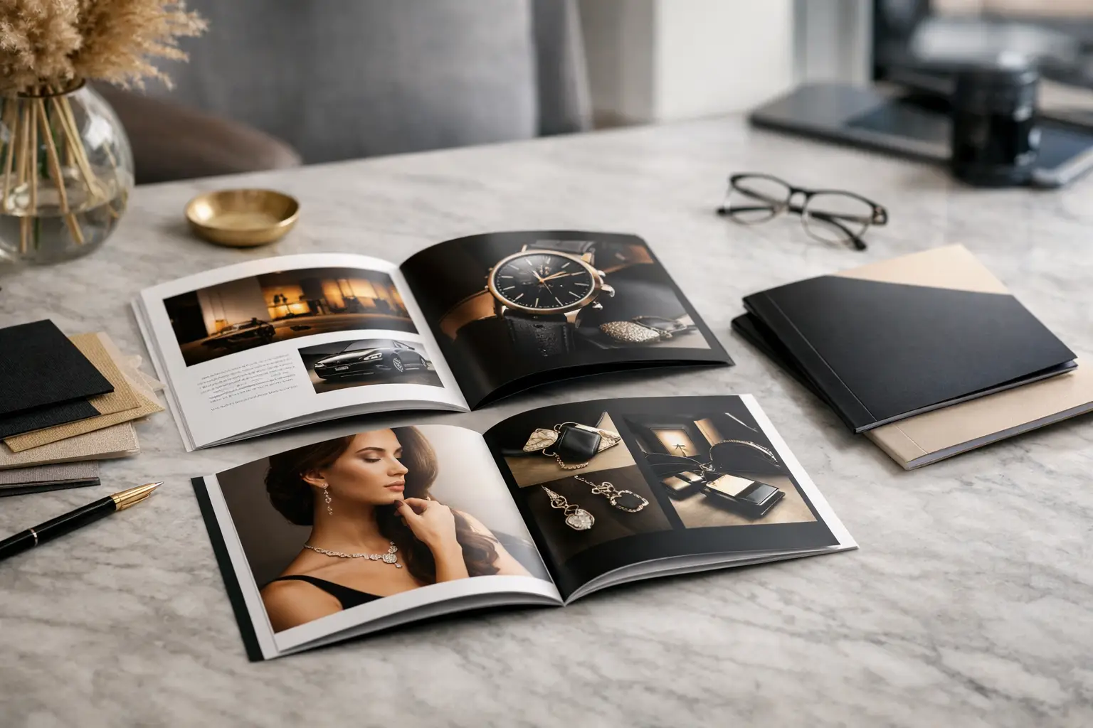
Brochure Design for Premium Brands That Performs
A premium brochure is often handled after the first conversation has ended. It may sit on a sales suite table, be presented in a boardroom, arrive in a carefully prepared pack or be sent as a polished PDF. That makes brochure design for premium brands far more than a print exercise. It is a practical piece of brand evidence: proof that the product, development or service has been considered in every detail.
For property developers, architects and brand teams, the standard is especially high. Buyers and stakeholders expect the brochure to reflect the quality being promised, whether they are considering a new flat, a destination scheme, a high-value product or a professional service. If the creative direction, imagery and material choices do not support that promise, the gap is felt immediately.
What brochure design for premium brands must achieve
Premium is not a matter of adding foil, thick paper and a dark colour palette. Those choices can be effective, but only when they support a clear idea. A brochure needs to make the reader feel assured about what they are considering, while giving them the information needed to take the next step.
That starts with positioning. A city-centre residential development may need to communicate architectural confidence, connected living and investment value. A consumer brand may need to demonstrate provenance, performance or considered craftsmanship. The design should establish that hierarchy quickly, then carry it consistently from cover to final page.
The strongest brochures combine three disciplines: a distinctive visual identity, an intelligent editorial structure and production quality that holds up in the hand. None can compensate for the absence of the others. Beautiful imagery without a clear sales journey can feel decorative. Detailed specifications without breathing space can feel difficult to navigate. Exceptional print finishing applied to an unfocused concept simply makes an expensive mistake more visible.
Start with the reader’s decision, not the page count
Before layouts are explored, clarify what the brochure must help someone decide. This is where premium projects can become unnecessarily complicated. Teams often have a great deal to say about a scheme or brand, but the reader does not need every message at once.
A useful brief defines the audience, the setting in which the brochure will be used and the action it should encourage. A brochure for prospective purchasers in a marketing suite may warrant a more tactile, spacious format than a digital document intended for early-stage investor conversations. A short, highly curated piece can create anticipation; a longer brochure can provide reassurance where specifications, plans and technical details carry weight. The right approach depends on the sales process rather than a fixed notion of what premium should look like.
Content should then be arranged around the natural questions a reader asks: What is this? Why does it matter? What will it feel like to own, visit or use? Why should I trust the people behind it? How do I move forward? When that journey is clear, the creative work has a commercial purpose.
Build a visual system, not a collection of pages
A premium brochure gains authority through control. Typography, grids, image treatment, captions, diagrams and page pacing need to feel as though they belong to one coherent system. This does not mean every spread should look identical. It means each variation is intentional.
Typography is often where quality is either established or undermined. A refined typeface can give a brand character, but legibility must still lead. Overly delicate fonts, small reversed copy and long lines of text can make a brochure feel less considered, not more. A clear type hierarchy allows a reader to scan key messages while rewarding those who spend longer with the detail.
White space has a similar role. It creates focus, improves readability and gives imagery room to carry emotional impact. Yet excessive empty space can become unhelpful if it forces essential information into an awkward secondary document. Premium design is selective, not sparse for its own sake.
Put imagery at the centre of the proposition
For unbuilt property, the quality of CGI visualisation is central to the brochure’s credibility. Exterior views should establish the architecture and its relationship to place. Interior CGI should make scale, light, finishes and lifestyle tangible. Floor plans, location maps and site plans need the same level of visual discipline, rather than being treated as technical inserts added at the end.
For established places and products, photography and CGI can work together. Photography may provide authenticity through people, materials and local context, while CGI can show unavailable views, product variations or future phases. The key is consistency in colour, lighting, retouching and composition. A brochure loses polish when one image style feels editorial, another feels synthetic and a third appears to have come from a different campaign.
Give facts the same care as hero spreads
A purchaser may be drawn in by a striking image, but confidence is built in the detail. Specification pages, amenities, dimensions, sustainability credentials, technical diagrams and contact information should be easy to locate and straightforward to read.
This is particularly relevant in property marketing. A well-designed floor plan provides practical clarity without diluting the brand experience. Similarly, a location page should help readers understand connectivity and local character, rather than relying on generic lifestyle claims. Information design is part of the luxury experience because it respects the reader’s time.
Material and print choices should reinforce the idea
Print can create a level of presence that digital cannot fully replicate. The weight of the stock, texture of the cover, quality of binding and precision of finishing all communicate something before the first page is read. However, production choices should be led by the audience, budget and expected shelf life.
An uncoated stock can feel tactile and architectural, while a coated finish can make colour-rich imagery more vivid. Foil, embossing, debossing, spot varnish and edge painting can add distinction, but only when used with restraint. A single well-placed finishing detail is often more effective than several competing techniques.
Format matters too. A landscape brochure may suit wide architectural views, whereas portrait proportions can feel more editorial and work well for fashion-led or hospitality brands. Binding choices influence both perceived value and usability. Perfect binding can support a substantial document; saddle stitching may be better for a concise brochure that needs to open flat and be economical to reproduce.
Early collaboration between designer and print supplier avoids avoidable compromises. Paper availability, colour profiles, folding, bleed, finishing tolerances and delivery times all affect the final result. Leaving print considerations until artwork is complete can lead to revised specifications, additional cost or a design that cannot be produced as intended.
Design print and digital as connected experiences
A premium printed brochure should not be a static relic in a digital campaign. It can become the anchor for a wider set of sales and marketing materials: launch invitations, social assets, email campaigns, presentation decks, sales-suite graphics and downloadable PDFs. The aim is not to repeat every page everywhere, but to maintain recognisable creative cues across every touchpoint.
Digital versions require their own consideration. Fine type, subtle foils and tactile finishes do not translate directly to a screen, so the PDF needs strong navigation, sensible file size and imagery that remains clear on common devices. For property developments, interactive 360° tours, film and CGI can extend the brochure’s story, allowing audiences to move from an overview into more immersive detail.
Working with one studio across CGI, branding and brochure design helps prevent visual drift. At TDR Creative, this joined-up approach allows the same creative direction to carry from early visualisation through to print-ready collateral, while keeping approvals and production coordination clear.
Avoid the familiar signs of an underdeveloped brochure
Premium brands rarely suffer from a lack of ambition. More often, the problem is trying to include too much, too late. Last-minute copy, unapproved images and late plan revisions can force a carefully developed design into a crowded, inconsistent document.
It is also worth avoiding imitation. A brochure that copies the conventions of every other luxury competitor may look competent, but it will be hard to remember. Distinction can come from a sharper editorial voice, an unexpected format, better photography or a more confident use of space. It does not need to be loud.
The most reliable process brings the right people together early: client stakeholders, marketing leads, architects where relevant, copywriters, visualisers, designers and print specialists. Agreeing the narrative, asset list and approval stages before production protects both quality and deadline.
A brochure earns its place when it gives people confidence to continue the conversation. Begin with the decision your audience needs to make, then give every word, image and production choice a clear job in helping them make it.
