Home » Packaging Design Trends 2026 Worth Watching
Packaging Design Trends 2026 Worth Watching
A pack has only a few seconds to earn attention, communicate value and feel right in the customer’s hand. That pressure is shaping packaging design trends 2026 more than any passing visual fashion. For consumer brands, the priority is not decoration for its own sake. It is creating packaging that is distinctive on shelf, credible online, practical to produce and consistent with the wider brand experience.
The strongest work this year will pair creative character with clear commercial thinking. Material choice, typography, structure, photography and CGI all need to work together, whether a product is being sold in a supermarket aisle, through a marketplace listing or direct to consumer.
Packaging Design Trends 2026: Clarity With Character
Minimalism is not disappearing, but it is becoming more purposeful. The restrained, generic packs that once signalled premium quality are increasingly difficult to distinguish from one another. Brands are moving towards cleaner hierarchies with more ownable assets: a confident colour system, a recognisable shape, a distinctive type treatment or an illustration style that cannot be mistaken for a competitor.
This does not mean every surface needs to be loud. In crowded categories such as food, beauty, wellness and household products, restraint can still be highly effective. The difference is that every element must earn its place. A clear product name, an easy-to-read benefit and one memorable brand cue often outperform packaging overloaded with claims, badges and visual noise.
For marketing teams managing ranges rather than one-off products, this approach has another advantage. A well-built visual system makes it easier to introduce new flavours, formats and seasonal editions without losing recognition. Consistency should not create sameness; it should make the range easier to navigate.
Tactile Detail Is Becoming a Stronger Brand Signal
As more purchasing decisions begin on a screen, physical packaging has a greater role to play once the product arrives. Customers notice the feel of uncoated stocks, embossed marks, textured labels, soft-touch finishes and carefully chosen closures. These details can give an everyday product a considered, premium quality.
The trade-off is straightforward: finishing can add cost, complexity and lead time. It should therefore support the proposition rather than act as a luxury add-on. A specialist coffee brand may benefit from a tactile label that reinforces craft and provenance. A high-volume household product may achieve better returns through stronger shelf colour, a clearer pack architecture and a finish that remains efficient at scale.
Structural design is also receiving more attention. A distinctive bottle silhouette, carton opening or refill format can make a product memorable before any graphics are read. However, bespoke structures are not automatically the right answer. Existing pack formats can often be elevated through intelligent graphics and material specification, without the development costs attached to a completely new mould or dieline.
Sustainability Needs Evidence, Not Visual Shortcuts
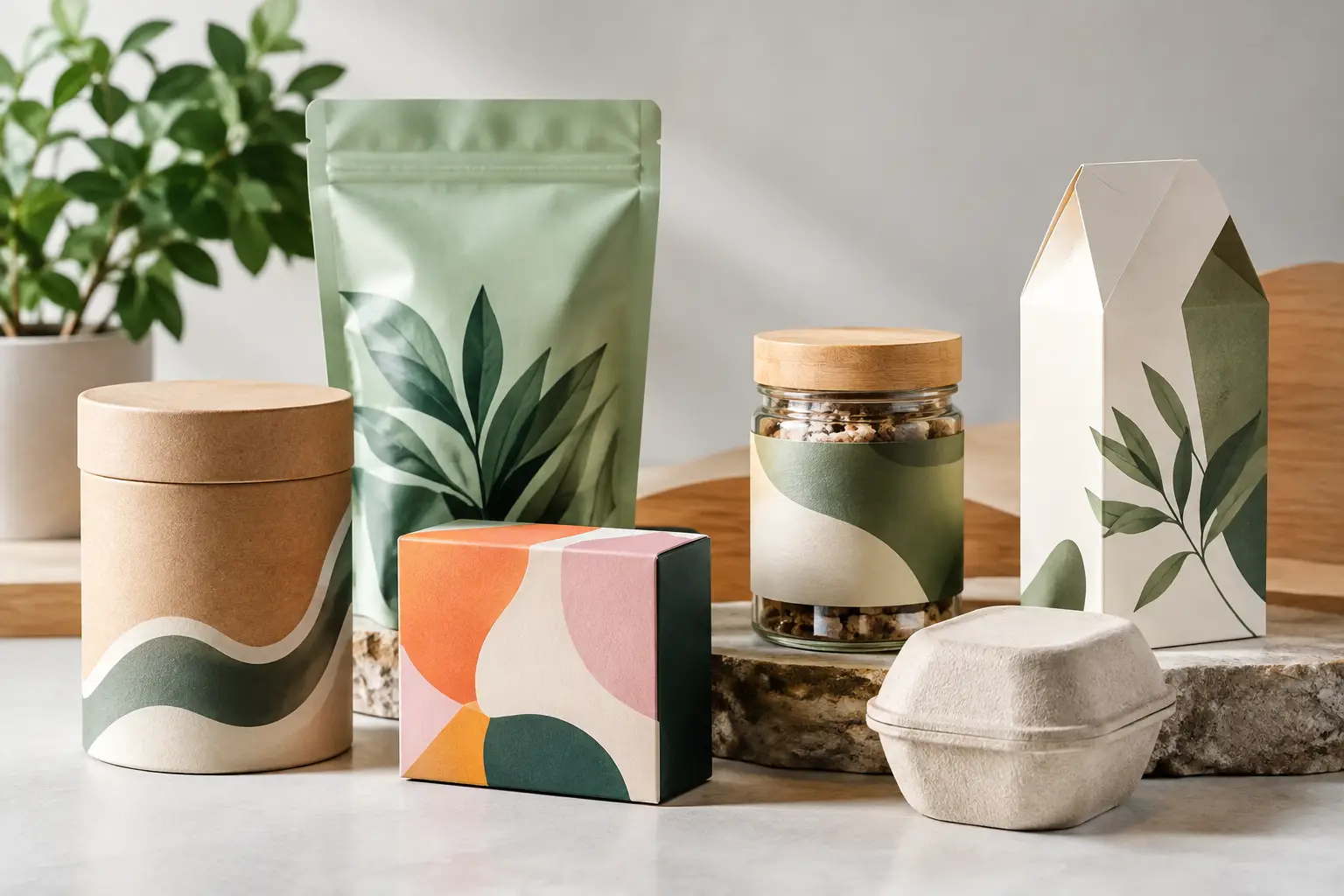
Natural colours, kraft textures and leaf motifs have become familiar shorthand for sustainability. In 2026, customers and retailers will expect more than those signals. Packaging needs to make practical environmental decisions understandable without making vague promises.
That may mean simplifying material combinations, reducing unnecessary components, improving recyclability guidance or designing refill and reuse into the product journey. The communication needs the same care as the pack itself. If instructions are confusing, the intended benefit is lost at the point of disposal.
There is an important design tension here. Sustainable packaging does not have to look deliberately plain or homespun. A refined cosmetics carton, a brightly branded pouch or a high-end spirits label can still make responsible choices. The best solution depends on the product, its route to market, its expected shelf life and the local recycling systems customers actually use.
For brands, the most credible route is to be specific. Explain what has changed, use accurate language and avoid turning the entire design into an environmental claim. Good packaging makes responsible choices visible while keeping the product benefit and brand story in focus.
Typography Takes the Lead
Typography is becoming a more prominent part of pack identity. Custom lettering, expressive serif fonts and confident condensed sans serifs are helping brands create recognition without relying on excess graphics. This is especially valuable for ranges that need to work across small labels, shipping cartons, retail displays and digital campaigns.
Legibility remains non-negotiable. Small-format packaging leaves little room for hierarchy mistakes, particularly where ingredients, allergens, usage instructions or compliance information must be included. An attractive layout that cannot be read at arm’s length will not perform on shelf.
The practical answer is to establish the hierarchy early. Decide what shoppers need to understand first, what they should discover second and what must be present for legal or operational reasons. Design can then give the brand personality around those requirements rather than attempting to force essential information into the remaining gaps.
Product CGI Is Part of the Packaging Process
Packaging design is no longer judged only on a printed prototype. A new product may need to appear in pitch decks, retailer presentations, paid social campaigns, e-commerce listings and point of sale long before final production samples are available. This is where accurate product CGI becomes a practical commercial tool rather than simply a presentation extra.
Photorealistic visualisation allows teams to test a pack in context: on a shelf, in a kitchen, within a gift set or alongside a complete range. It can reveal whether colours hold their impact under different lighting, whether foil catches attention or whether a label appears too busy at thumbnail size. Those findings are much more useful when they happen before a large print run.
For a launch campaign, CGI also helps maintain visual consistency across packaging, brochure design, retail displays and online content. At TDR Creative, combining graphic design and CGI in one studio helps keep that relationship controlled from concept through to campaign-ready assets. The pack is not treated as an isolated object; it is considered as part of the customer’s full brand experience.
Designed for Shelves and Screens
The shelf has not become less important, but it is no longer the only shelf that matters. Customers compare product packs in search results, social posts and online retailer grids where fine details disappear. A successful design needs a clear digital read as well as physical presence.
This often changes how brands approach front-of-pack design. A bold brand mark, simple product descriptor and decisive colour block can work strongly in a small online image. Fine illustration and tactile finishes can then reward closer inspection in store or at home. Designing for both environments is not a compromise if the hierarchy is right.
It is also worth testing the complete product family together. A pack that looks impressive alone may become difficult to shop when placed beside six related variants. Range architecture – including colour coding, naming conventions and flavour or format cues – can have a direct effect on customer confidence and repeat purchase.
More Human, Less Generic
Consumers are increasingly alert to packaging that looks as though it could belong to any brand in the category. In response, more businesses are using bolder illustration, local references, honest product imagery and language with a genuine point of view. The aim is not to chase novelty. It is to make the brand feel specific.
This is particularly relevant for independent and challenger brands, but established businesses have an opportunity too. A packaging refresh can retain familiar recognition while removing dated cues, clarifying the offer and giving the range a more contemporary presence. The risk lies in changing too much too quickly, particularly where customers rely on visual familiarity to find a trusted product.
The right brief begins with commercial questions: where will the pack be seen, what must it communicate, what will production allow and what should customers remember? Trend awareness is useful, but it should never replace those fundamentals.
The most effective packaging in 2026 will not simply look current. It will make the product easier to choose, easier to understand and more satisfying to receive. When creative direction, production knowledge and campaign visualisation are considered together, packaging becomes a dependable piece of brand infrastructure rather than a surface to update every season.
