Home » Product CGI for Packaging Mockups That Sell
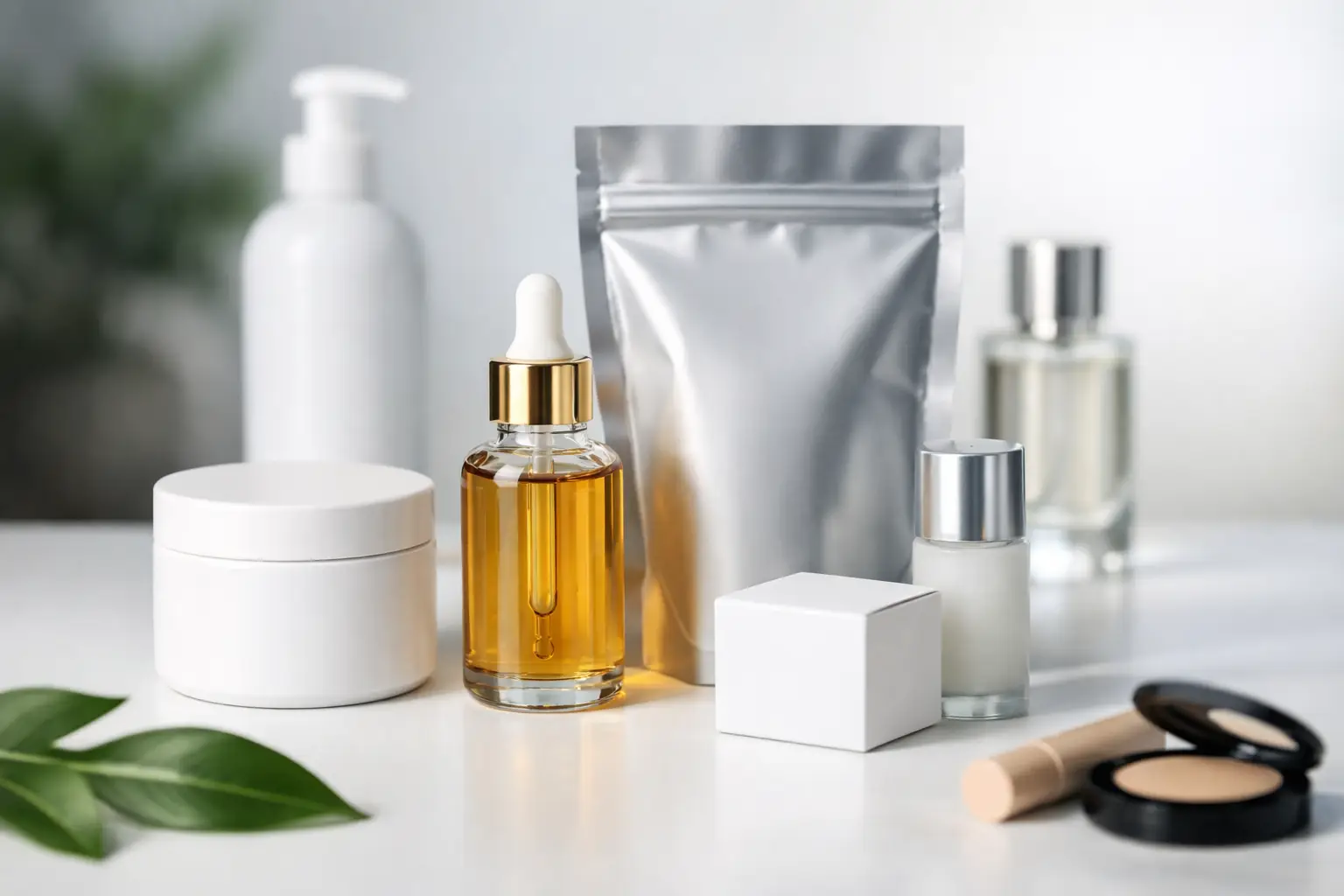
Product CGI for Packaging Mockups That Sell
A packaging concept can look convincing on a flat artwork file yet lose impact the moment it is placed on a shelf, photographed under studio lighting or viewed beside competing products. Product CGI for packaging mockups closes that gap. It shows how a pack will behave as a real object, giving marketing teams, designers and decision-makers a polished visual before stock, samples or photography are available.
For consumer brands, that can mean stronger retailer presentations, quicker sign-off and campaign assets ready well before a production run. For packaging designers, it means their work can be judged in the round, not merely as a cutter guide or front-facing label. The result is a more confident route from concept to market.
Why packaging needs more than a flat visual
Packaging is a physical brand experience. The shape of a bottle, the depth of a carton, the finish of a pouch and the way light catches a foil detail all affect how customers read a product. A two-dimensional mockup is useful during artwork development, but it cannot always communicate those details accurately.
Photorealistic CGI builds the pack as a three-dimensional asset, then applies the approved artwork, materials and finishes to its surface. A label can follow the curve of a jar. Embossing can cast a subtle shadow. A matt carton can sit differently under light from a gloss-coated sleeve. These are small visual cues, but they influence whether a product appears premium, trustworthy, natural, technical or value-led.
This matters particularly where a launch depends on first impressions. A new food range needs to look appetising at the point of sale. A skincare line needs to convey quality without appearing overworked. A household product may need to communicate practicality and clear product information from a distance. CGI gives teams the opportunity to test those impressions before committing to print or photography.
What product CGI for packaging mockups can achieve
The most useful packaging visualisation is not simply a beautiful image of a box or bottle. It is a flexible set of brand assets designed around real commercial decisions. Once the pack has been modelled, the same CGI scene can support multiple uses without starting from scratch each time.
A single approved product model can be presented as a clean e-commerce packshot, a styled campaign image, a retailer pitch visual or a point-of-sale concept. Different flavour variants, label colours and seasonal editions can be created from the same base model, making range development clearer and more cost-effective. If a product has not yet reached final production, CGI can also support pre-launch marketing with visuals that remain consistent with the intended finished item.
There is a practical advantage here for brand managers managing several suppliers. Rather than briefing one team for pack visuals, another for campaign layout and another for retail material, CGI and graphic design can be coordinated as part of one creative process. At TDR Creative, this combination helps maintain a consistent visual standard across the packaging itself and the wider materials used to sell it.
The details that make a mockup believable
A convincing CGI packaging mockup depends on more than accurate dimensions. It requires close attention to the materials, construction and visual context that make a product feel credible.
Form and proportion
The model must reflect the actual or proposed pack structure. This includes the shoulder profile of a bottle, the thickness of a lid, the folds of a carton, the seal on a pouch and the way products sit together in a multipack. Even slight inaccuracies can make a product feel artificial, especially when the audience knows the category well.
Where final technical drawings are not available, an experienced CGI team can work from early sketches, cutter guides, reference photographs or product dimensions. The key is being clear about what is fixed and what remains under development. CGI can support concept-stage work, but it should not accidentally imply that an undecided structural feature has been approved.
Artwork placement
Brand artwork needs to work around the pack, not simply sit on its front face. This includes label alignment, panel joins, barcode placement, legal copy areas and the visibility of key messages from the intended camera angle. A strong render can expose issues that are easy to miss on a flat proof, such as type becoming unreadable around a curve or a key design feature disappearing on a side panel.
For ranges with multiple SKUs, accurate artwork mapping is equally valuable. It allows teams to compare variants as customers will see them, ensuring the range feels joined up while each product remains easy to identify.
Surface finish and lighting
Material realism is often where packaging CGI succeeds or fails. Paperboard, glass, aluminium, plastic, foil and textured labels all respond to light differently. A gloss varnish should have controlled highlights, while a soft-touch finish should feel restrained. Metallic effects need enough contrast to read as metallic, but not so much that they look like chrome.
Lighting should serve the purpose of the image. A clean, front-led setup may suit an online shop or product brochure. More directional lighting can add atmosphere for a launch campaign. Neither is automatically better. It depends on whether the priority is clarity, premium appeal, a particular product benefit or a consistent look across a larger campaign.
Context and scale
A packshot on a plain background is often essential, but it is not the only useful visual. CGI can place a product in a believable setting without the expense and scheduling constraints of a physical shoot. A beverage can be shown chilled beside condensation, a cosmetics bottle can sit within a carefully art-directed bathroom scene, and a property developer can visualise branded welcome packs before they have been manufactured.
Context must be chosen with care. Over-styled scenes can distract from the product or suggest claims the packaging cannot support. The strongest environments reinforce the brand position and make the pack easy to understand at a glance.
A more effective approval process
Packaging projects can become costly when decisions are made too late. Artwork is approved, print samples arrive, and only then does the team notice that a finish looks too glossy, the hierarchy is weak on shelf, or a range lacks visual distinction. Product CGI provides a useful review point before those commitments are final.
The process normally begins with a clear brief: the pack format, artwork status, required views, brand guidelines, intended channels and deadline. Providing original artwork files, dimensions and material references early will improve accuracy and avoid unnecessary rework. If the job involves several variants, it is sensible to establish one hero product first, agree the visual direction, then roll the approved approach across the range.
At review stage, the focus should be commercial as well as aesthetic. Does the primary message read quickly? Is the pack recognisable at small scale? Does it sit convincingly beside related products? Will the chosen image crop work for social posts, retailer listings and printed collateral? These questions help turn a render into an asset with a clear job to do.
It is also worth agreeing which details need absolute precision. A hero visual for a national campaign may require meticulous representation of finishes, assembly and artwork. An early retailer pitch may instead need a faster concept visual that demonstrates range, format and shelf presence. Being honest about the intended use protects budget without compromising the value of the work.
When CGI is a better choice than photography
Photography remains the right choice for some packaging projects, particularly when the physical product is available and its real-world texture is central to the campaign. Food photography, for example, often benefits from the unpredictability and tactile detail of a real shoot. CGI is not a replacement for every photographic requirement.
Its value is strongest when products are unfinished, unavailable, frequently changing or difficult to shoot consistently. It is particularly effective for reflective surfaces, large SKU ranges, repeated campaign adaptations and visuals requiring unusual angles or environments. CGI also avoids the waste involved in producing multiple sample packs solely for a photoshoot.
The best approach can be a considered blend. CGI may establish the packaging, composition and branded environment, while photography brings in selected ingredients, people or tactile details. What matters is that the final image feels coherent and serves the campaign objective rather than showcasing a technique for its own sake.
Packaging visuals built for the whole campaign
A packaging render should not be treated as a one-off approval image. With the right planning, it becomes a long-term creative asset. The same product CGI can support brochure spreads, web banners, trade presentations, shelf-ready displays, social content and future variant launches. This is where a coordinated studio approach brings real value: the asset is created with the wider brand system in mind from the outset.
Before commissioning the work, decide where the product needs to appear and what it needs to communicate. A well-built CGI model gives a brand room to respond quickly when a buyer requests a new format, a campaign needs an additional crop or a product range expands. That flexibility is often what turns a packaging visual from a nice-to-have into a commercially useful investment.
