Home » Site Plans for Planning Presentations That Persuade
Site Plans for Planning Presentations That Persuade
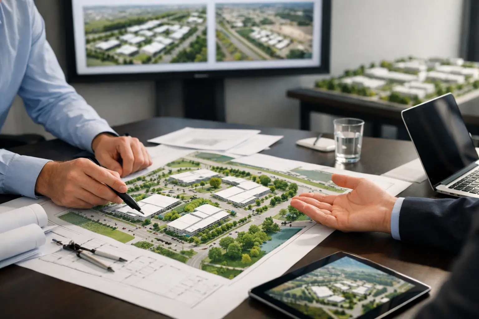
A planning presentation can succeed or fail before anyone reaches the design statement. When a committee member, local resident or project stakeholder cannot quickly understand where a proposal sits, how vehicles enter, where landscaping changes or what is retained, confidence falls. Well-produced site plans for planning presentations make the scheme legible at a glance, turning technical information into a clear, credible case for approval.
For developers, architects and planning teams, that clarity is not simply a matter of presentation. It can reduce avoidable questions, give audiences a shared reference point and ensure the merits of a proposal are not lost in dense drawings or inconsistent campaign materials.
What a planning presentation site plan needs to do
A site plan submitted as part of a planning package has a specific technical purpose. It must accurately show the application boundary, surrounding context and required information at an appropriate scale. A presentation site plan has a related but different job: it must help people understand the proposal quickly and confidently.
That does not mean simplifying the scheme to the point of ambiguity. It means establishing a visual hierarchy. The proposed buildings, access points, open space, routes, parking, retained features and key neighbouring assets should each be easy to identify. Information that is legally or technically necessary but less relevant to the immediate discussion can remain available without competing for attention.
The strongest plans answer the questions people tend to ask first. Where is the site? What is changing? How will people move through it? What happens at the edges? How does it relate to homes, roads, green space and existing buildings nearby?
A single well-considered plan will not answer every planning matter. It should, however, give the room enough orientation to follow the presentation and assess the evidence that follows.
Why technical drawings alone are rarely enough
Architectural and engineering drawings are essential working documents, but they are not always designed for a mixed audience. Line weights may be optimised for accuracy rather than readability on a projected screen. Layers of notation, dimensions, hatching and consultant information can make a technically correct drawing difficult to interpret from the back of a council chamber.
This is particularly relevant on larger or more complex developments, where a presentation may need to explain several phases, different tenure types, new public realm, drainage strategies and varied access arrangements. Without a visual structure, the audience may spend valuable time trying to locate the essentials.
A presentation plan should retain the authority of the underlying technical information while giving the proposal a more deliberate visual narrative. Clear colours, restrained labels, well-managed contrast and a logical key can achieve this without making the scheme look promotional at the expense of accuracy.
There is a balance to strike. Over-styled graphics may look attractive but risk obscuring important distinctions. Conversely, a plan that is too close to an unedited CAD output may be accurate yet fail to communicate. The right approach depends on the scheme, the audience and the setting in which it will be viewed.
Building site plans for planning presentations with purpose
The most effective work starts with the presentation objective, not a visual treatment. A public consultation board, planning committee slide deck and investor presentation may use the same base plan, but they need different levels of information and different ways of directing attention.
Start with the decision being supported
Before artwork begins, define what the audience needs to understand or decide. For a residential development, this could be the relationship between proposed homes and existing neighbours. For a commercial scheme, it may be servicing, arrival, public access or landscape-led placemaking. For a phased masterplan, the focus may be the sequence of delivery and the benefits provided at each stage.
This focus informs every design choice. If the key issue is pedestrian permeability, routes should read immediately. If the scheme relies on retained woodland or ecological buffers, those areas need clear visual prominence. If the proposal improves an awkward site entrance, the existing and proposed conditions may need to be shown side by side rather than compressed into one crowded image.
Establish a hierarchy before adding detail
A good site plan guides the eye from broad context to meaningful detail. Typically, the application site and proposed elements should be the first things the audience sees. Existing surrounding buildings, roads and landscape then provide context, while secondary information sits further back.
Colour is useful when used with discipline. A limited palette can distinguish proposed development from existing fabric, public landscape from private areas, and vehicle movement from pedestrian routes. The colours should also work in print, on screen and in greyscale where possible. Relying on colour alone can exclude viewers and create confusion when plans are photocopied.
Labels deserve the same care. Long, dense call-outs make a plan harder to scan. Short, purposeful labels – such as “new pedestrian route”, “retained trees” or “visitor parking” – work better when paired with a concise key and supporting slides where detail is required.
Show the site in its real context
Planning decisions are rarely made by looking only inside a red line boundary. The relationship between a proposal and its surroundings can be central to concerns about amenity, access, heritage, views, traffic and character.
Context should be informative rather than generic. Nearby streets, landmarks, public transport links, watercourses, mature planting, existing homes and key access points may all be relevant. The trick is to show enough of the surrounding area to establish the relationship without reducing the proposal to an unreadable patch in the middle of a vast map.
On sensitive sites, an inset location plan can help orientate an unfamiliar audience, while the main plan concentrates on the immediate setting. This is often more useful than trying to make one drawing perform both jobs.
Make movement easy to follow
Access and circulation are regular sources of scrutiny. A clear plan can show how vehicles, pedestrians, cyclists, service vehicles and emergency access will use the site, provided it does not turn into a tangle of arrows.
Use routes selectively and explain them in a sequence that matches the presentation. A speaker might first show the principal vehicular entrance, then pedestrian connections, then servicing. Each point should be visible without asking the audience to decode several competing route types at once.
Where the distinction matters, separate diagrams can be more effective than one overloaded plan. This is not duplication. It is a practical way to make important information easier to absorb.
Prepare for the room, not just the drawing board
A plan can look excellent at A1 and still underperform when projected. Fine text, pale colours and intricate linework often disappear on a screen, particularly in rooms with uneven lighting or older display equipment. Test the artwork at the size and format it will actually be used.
For planning committee presentations, a simplified screen version is usually valuable. It may feature larger labels, stronger contrast and fewer layers of annotation than the printed board. For public consultation, boards should allow people to understand the proposal without a presenter standing beside them, so keys and explanatory notes need to work independently.
Consistency also matters across the wider presentation. When the site plan, CGI views, floor plans, landscaping imagery and brochure graphics share an identifiable visual language, the scheme feels considered and easier to navigate. It also prevents confusion caused by mismatched colours, building labels or orientations between documents.
Common mistakes that weaken a planning presentation
The most frequent problem is trying to show everything at once. A planning project involves a great deal of information, but a presentation is not a filing system. If every note, boundary, annotation and consultant layer receives equal treatment, nothing is prioritised.
Another issue is using a generic aerial image without enough site-specific interpretation. Aerial context can be helpful, particularly for large sites, but it should support understanding rather than serve as decoration. Proposed work must remain clear against the image, and neighbouring features should be accurately represented.
Poor orientation creates unnecessary friction too. If north points one way on a site plan, another on a CGI overview and another in a transport graphic, audiences lose confidence. Agree a consistent orientation where possible and state it clearly when a different view is necessary.
Finally, avoid presentation graphics that imply certainty where design details remain subject to approval or technical development. Credibility is strengthened when plans are visually persuasive but properly qualified. A polished visual should clarify the proposal, not overstate it.
A coordinated creative process saves time later
Site plans are often prepared late, once planning documentation is already taking shape. That can lead to rushed artwork, repeated amends and visual inconsistencies between the presentation and marketing material that follows.
Bringing graphic design and CGI thinking into the process earlier gives teams a stronger base. The approved site plan can inform exterior visualisations, sales collateral, public consultation materials and stakeholder updates, with common labels, landscape treatment and built-form cues carried across each item. It is a more efficient route than rebuilding visual logic separately for every output.
At TDR Creative, this coordinated approach combines technical accuracy with presentation-led design, helping project teams communicate proposals with clarity while retaining a professional, commercially focused finish.
A planning presentation does not need to make every viewer an expert in the scheme. It needs to let them see the proposal, understand its relationship to the place around it and focus their attention on the decisions that matter.
