Home » Interior CGI Lighting That Sells the Space
Interior CGI Lighting That Sells the Space
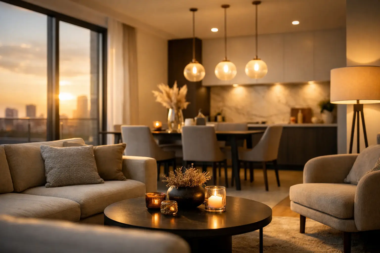
A well-modelled kitchen can still fall flat if the lighting feels wrong. For property marketing, architecture and brand imagery, interior CGI lighting is what turns an accurate room into a space people can picture themselves living, working or buying into. It directs attention, gives materials credibility and sets the emotional temperature before a viewer has read a single line of sales copy.
For developers, architects and marketing teams, that makes lighting a commercial decision as much as a creative one. The goal is not simply to make a render brighter or more dramatic. It is to present the scheme truthfully, attractively and with enough visual clarity that its value is immediately understood.
Why interior CGI lighting has such a strong commercial impact
People do not assess an interior in separate technical layers. They read the whole image in seconds. They notice whether the room feels generous, whether the finishes look premium, whether there is a sense of calm, and whether the layout appears practical. Lighting influences every one of those judgements.
Natural-looking daylight can make a compact flat feel open and liveable. Warm pools of light can give a lounge, restaurant or hospitality setting a more inviting character. Carefully placed artificial fittings show how a space will work after dark, while ambient illumination prevents shadowed areas from making a room seem smaller than it is.
This matters particularly for unbuilt developments. Prospective buyers and investors cannot walk through the finished rooms, test the view or see how sunlight moves across a surface. A CGI image has to answer those questions with conviction. The lighting needs to support the architectural intent without overstating it.
There is a balance to strike. An image that is too bright can bleach out timber grain, fabric texture and subtle colour changes. An overly moody image may look striking in a portfolio but conceal the proportions and specification a buyer needs to see. The best result is usually one that feels aspirational while remaining believable.
Start with the story the space needs to tell
Before light sources are placed, establish the role of the image. A penthouse living area marketed to owner-occupiers may call for soft late-afternoon daylight, a warm interior glow and a view that feels part of the room. A build-to-rent scheme may need bright, clear imagery that demonstrates room sizes, storage and adaptable living. A premium retail or product setting may require more contrast and carefully controlled highlights to make the brand feel distinctive.
The room itself should guide the approach. North-facing spaces benefit from a treatment that avoids becoming cold or lifeless, whereas rooms with generous glazing may need subtle light control to prevent harsh contrast. Material choices also matter. Pale plaster, polished stone, brushed brass, matt cabinetry and dark upholstery all react differently under the same setup.
A considered CGI brief gives the creative team the information needed to make the right choices early. It should cover the target audience, intended use, time of day, visual references, key finishes and any features that must be prominent. For a multi-image campaign, it should also confirm which views need to work together. A set of visuals where every room has a different, unrelated lighting style can weaken the overall presentation.
Daylight should feel designed, not accidental
Daylight is often the foundation of interior CGI lighting because it establishes the scale and orientation of a room. However, realistic daylight is more nuanced than placing a bright source beyond the window. Its quality changes with the season, weather, orientation, glazing, surrounding buildings and the depth of the space.
Soft overcast light offers an even, refined look that is useful when the priority is showing finishes and layout. It reduces harsh shadows and works well for brochure imagery, kitchen CGI and rooms with several focal points. Sunlight, by contrast, adds direction and energy. It can reveal texture beautifully and create an appealing connection between indoors and outdoors, particularly in lifestyle-led residential marketing.
Neither option is automatically better. Direct sun may be ideal for an image that needs atmosphere, but it can produce deep shadows that hide important detailing. Overcast lighting can be more commercially practical, yet may need carefully judged warmth to avoid feeling flat. The most effective choice depends on the architecture, the selling point and where the image will appear.
Window treatments are part of this decision. Sheers can diffuse bright conditions and make a room feel private without blocking the sense of daylight. Blinds, curtains and external views need to support the intended narrative rather than compete with it. Even the landscape beyond the glass affects perceived light levels and the quality of reflections.
Artificial light adds depth, hierarchy and realism
A convincing interior is rarely lit by daylight alone. Practical fittings bring a room to life by showing how it will feel at different times and by creating layers within the composition. Ceiling downlights provide general illumination, but relying on them too heavily can make a render feel clinical and uniform.
The strongest interiors tend to combine ambient, task and accent lighting. Ambient light establishes the overall level of brightness. Task lighting supports a specific activity, such as a pendant over a dining table, under-cabinet lighting in a kitchen or a reading lamp beside a chair. Accent lighting gives visual hierarchy by drawing attention to joinery, artwork, shelving or architectural texture.
That layering should reflect the actual design. If a proposed scheme includes decorative pendants, wall lights or integrated LED details, they deserve to be treated as working features rather than decorative objects switched on at random. Their light output, colour temperature and spill should make sense within the room.
Warm light is often associated with comfort, but using an overly amber tone throughout can distort finishes and date the image. Cooler light can feel crisp and contemporary, though it may make a residential setting seem impersonal. A well-balanced approach uses colour temperature with restraint, allowing materials to retain their intended character.
Materials reveal whether the lighting is credible
Lighting and material creation cannot be treated as separate stages. A surface only looks convincing when it responds to light in a believable way. Timber needs variation in grain and a soft reflection that suits its finish. Marble needs depth, veining and controlled highlights. Brushed metal should catch light differently from polished chrome, while velvet and boucle need enough shadow detail to show their tactile quality.
This is where a technically accurate scene earns its value. Reflections should reveal the room without becoming distracting. Glass should have presence without looking opaque. Dark finishes need sufficient detail to read as premium rather than disappearing into black areas. These details may be subtle, but they shape whether a viewer trusts the image.
For marketing teams, this has a practical advantage. When CGI, brochures, sales material and digital campaigns are developed with the same visual standards, the scheme looks consistent wherever it appears. The interior render is not an isolated asset. It becomes part of a wider brand presentation.
Composition determines what the viewer notices first
Lighting should support composition, not overpower it. Every image needs a clear focal point, whether that is a kitchen island, a view, a statement staircase, a product display or a carefully furnished seating area. The eye should be led there naturally through brightness, contrast and the placement of highlights.
This is particularly useful when a room has a feature that needs to justify value. In a high-specification flat, it may be the stone worktop, bespoke joinery or terrace view. In a show home, it may be the dining space that demonstrates entertaining potential. In a branded environment, it may be a product or point of sale display.
Avoid the temptation to light every corner with equal intensity. Uniform brightness removes depth and makes a room feel less considered. Equally, dramatic darkness should never obscure the elements a prospective customer needs to assess. The image must work quickly on a property portal, a brochure spread, social media post or large-format display.
Plan lighting across the full image set
Single hero images are valuable, but property and brand campaigns usually need a sequence of visuals. A living room, bedroom, kitchen, bathroom and amenity area should feel like parts of the same development, even when their layouts and window positions differ.
A lighting strategy across the full set helps achieve that consistency. The team can establish an overall daylight direction, palette and level of contrast, then adapt the treatment for each space. This prevents the common issue of one image appearing crisp and cool while the next is deeply warm and cinematic without any clear reason.
It is also sensible to plan alternative versions where the campaign needs them. A daylight image may be best for sales collateral, while an evening version can add impact to a launch presentation or social campaign. Creating those variations from a well-built scene is more efficient than beginning again later, provided the requirement is identified at the briefing stage.
A practical briefing checklist for better results
To keep production focused and reduce avoidable revisions, agree the key decisions before final rendering begins:
- the audience and commercial purpose of each image
- the preferred time of day and general mood
- the materials, fittings and finishes that must be accurate
- the architectural features or views that need emphasis
- how the CGI will sit alongside brochures, branding and other campaign assets
Reference imagery can be useful, but it should communicate an intention rather than become a rigid template. A reference may capture the desired softness of daylight, the premium feel of a hospitality interior or the way brass fittings are highlighted. The finished visual still needs to reflect the specific project, its architecture and its brand.
At TDR Creative, interior visualisation is developed with this wider marketing context in mind. Combining CGI and graphic design within one studio helps ensure that lighting, imagery and campaign materials work together with purpose, from early concepts through to final delivery.
The right light does more than make a room look attractive. It gives people a reason to pause, understand the space and imagine what it would be like to occupy it. That is the standard worth setting before the first render is approved.
